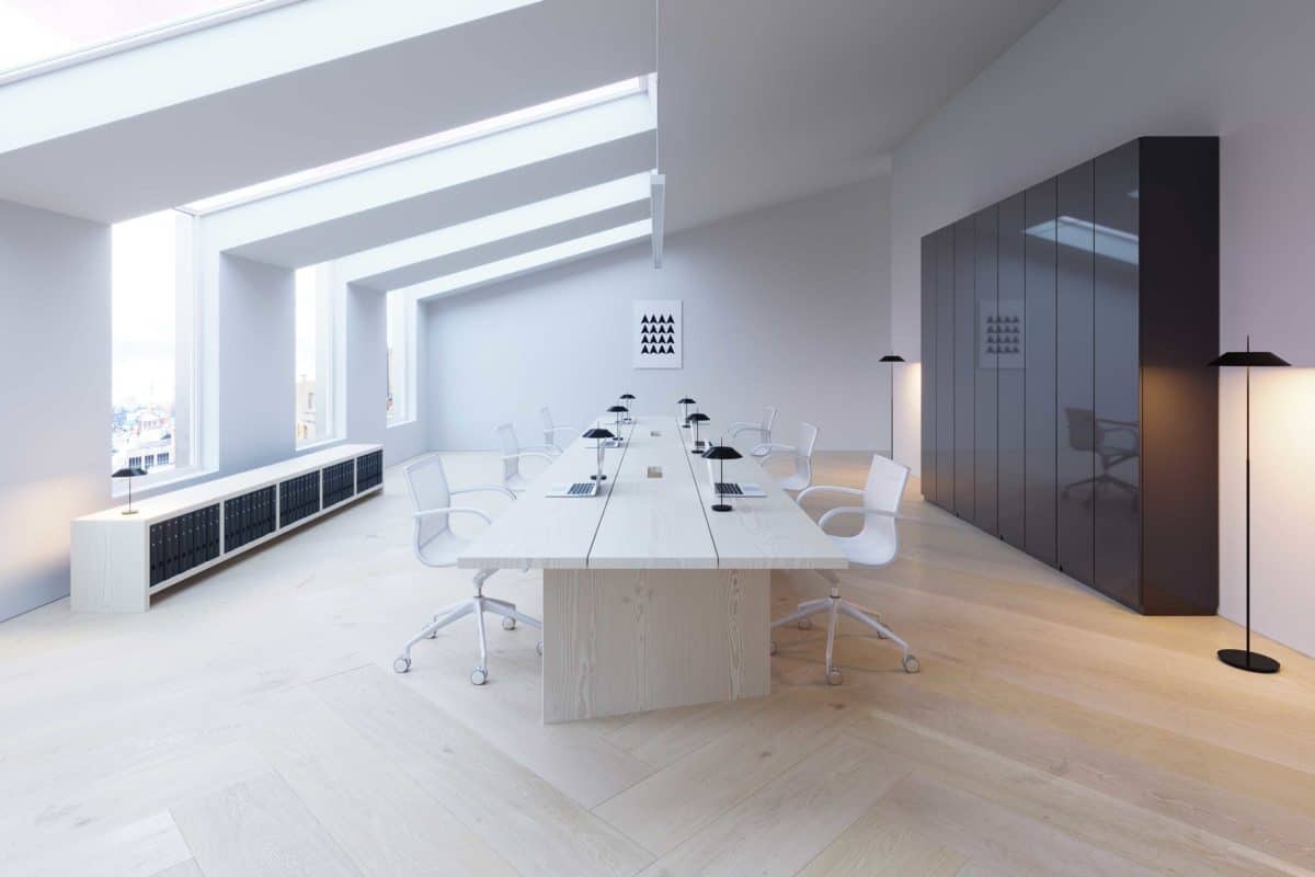
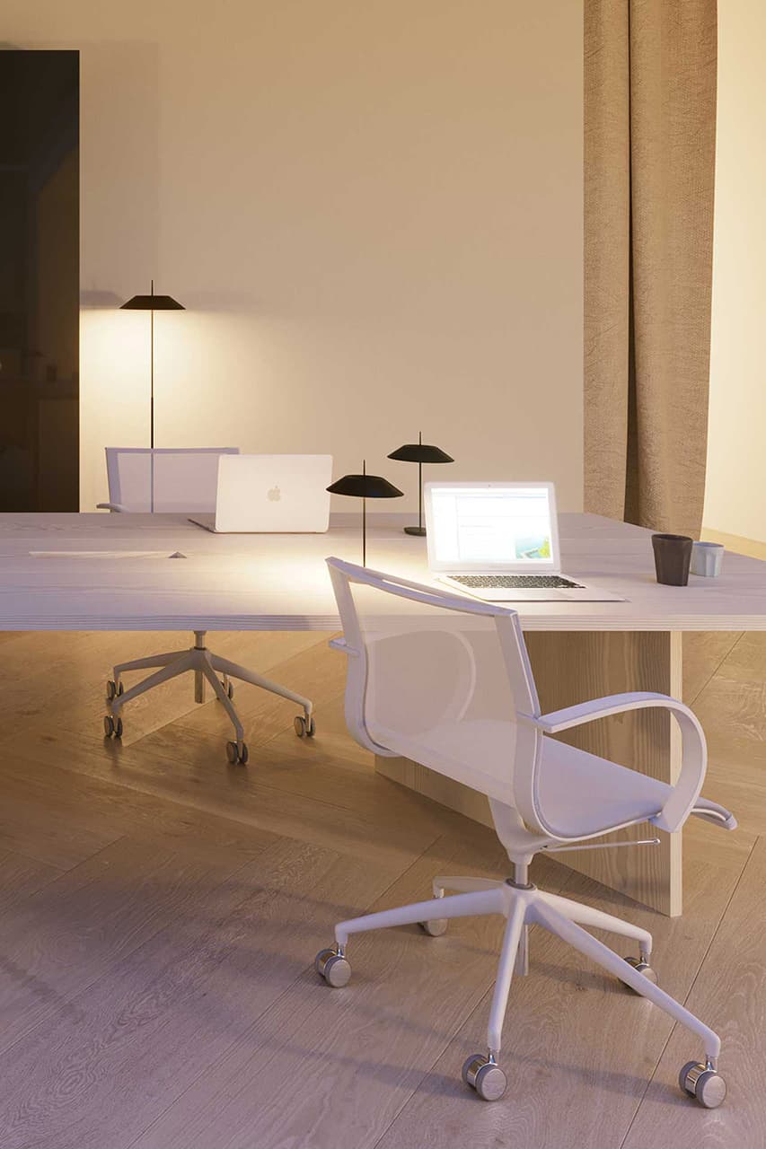
The goal was to create 3D visualisations for office interior in Denmark, Copenhagen. Our team had all the control from very beggining – interior design concept, furniture concept and of course – visualisation style and development. Our goal and main task was to show how special the space is with light comming from roof windows.
We were asked to create a concept and 3D visualisations for existing office space. The goal of the client and architect was to have images and concept showing how good and nice can be the space after reconstruction. Some time after finishing I received approval from architect telling that renders were most influential tool when discussing with client.
Actually, we are lovers of Dinesen floor manufacturer. We love how natural and calm their designs look. So we’ve used many references from them and loved very specific idea – the interior has to be calm and very subtle. That is the reason why there are no colors, just white, black and natural wood. Having such a color pallete let’s human to be most important part of the design and office. The design and space changes every day depending on how people behave and look. Shortly – human first.
We are always getting comments how beautiful the light and illumination is in the images. And it comfirms our team thoughts and basics – we believe that natural lighting and materials are the main keys to successful concepts and images. With such a successful project we still believe that human is the main element of the design which deserves a greater amount of attention. Of course, people would ask: why there is no any people in your visualisation? The answer is simple – everyone want’s to see himself in beautiful space, so why would we disturb viewer with strangers in the space?
- 3D artist/architect: Edvinas Skiestenis
- Architect: Kely Boke


