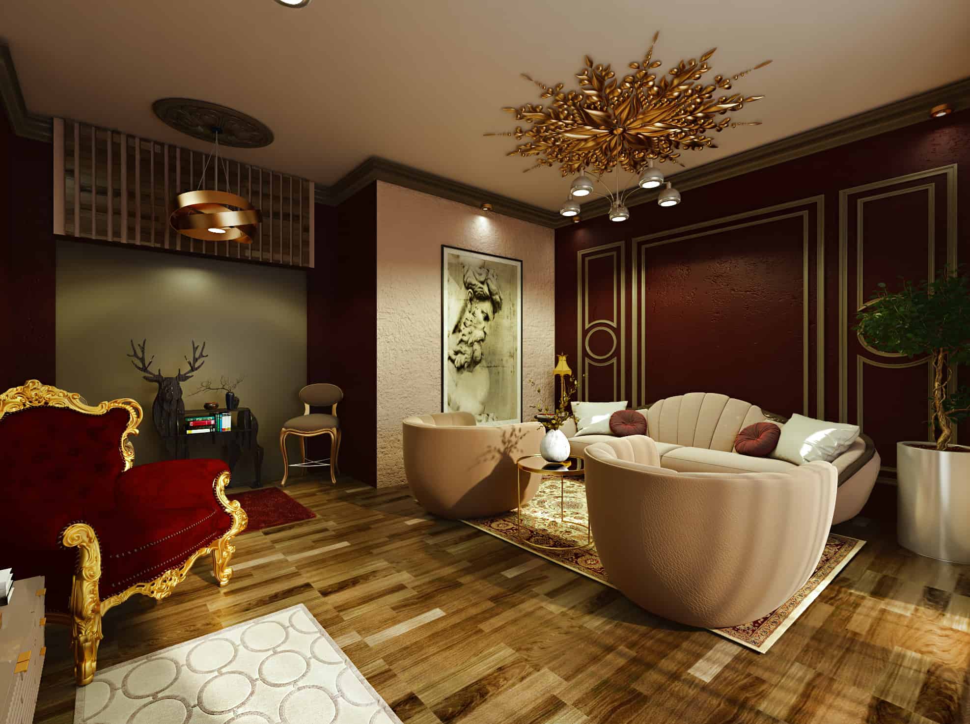
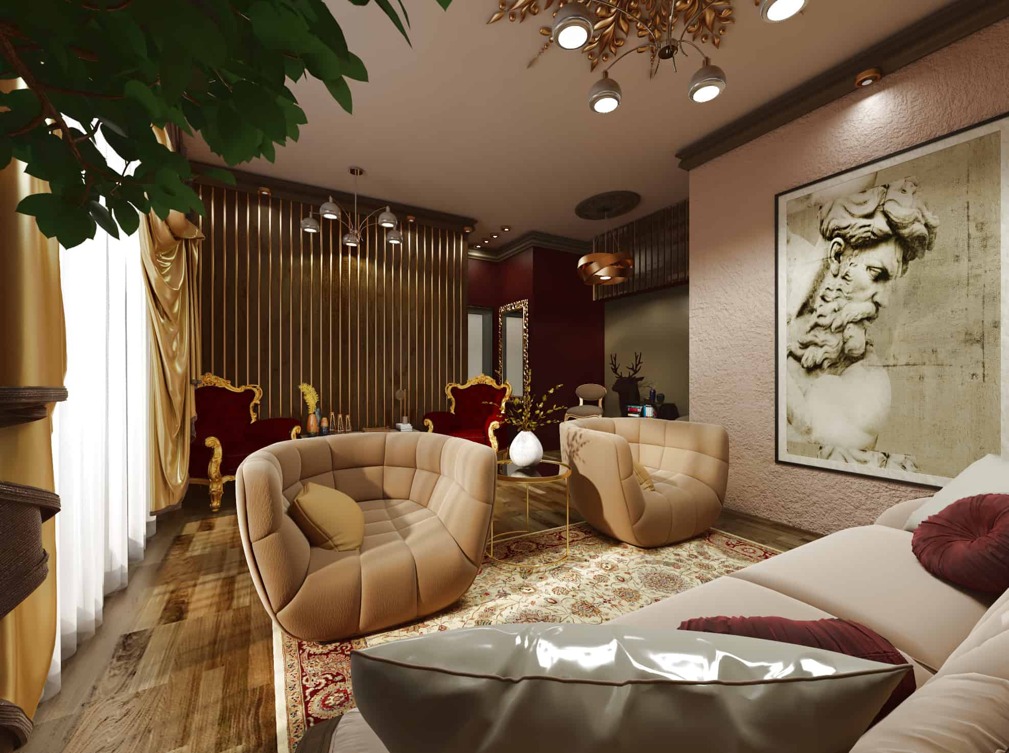
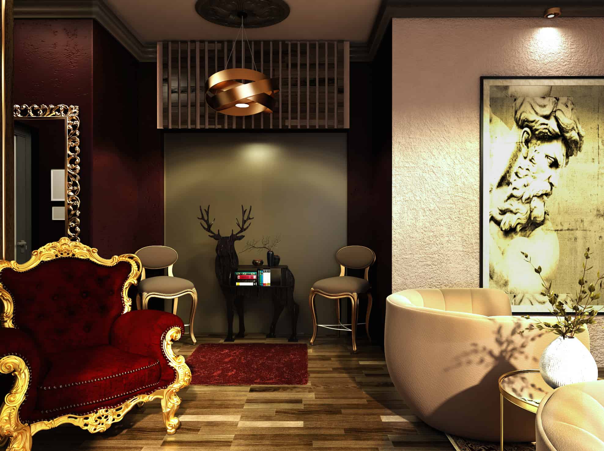
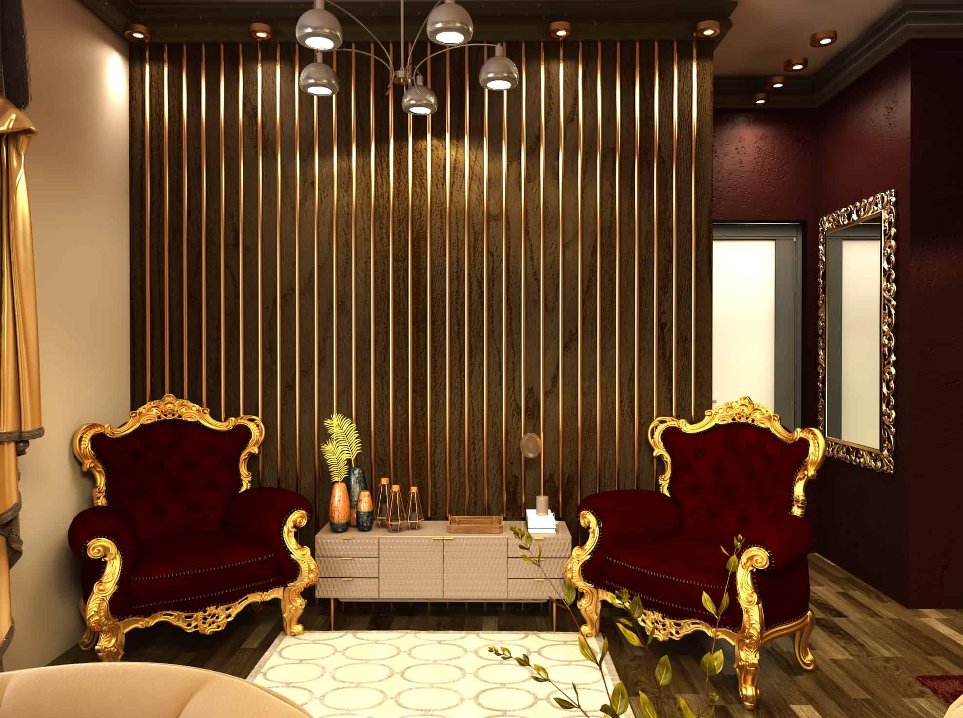
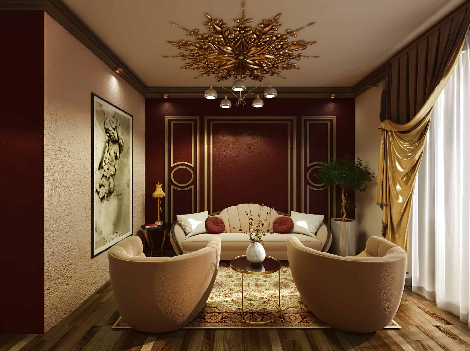
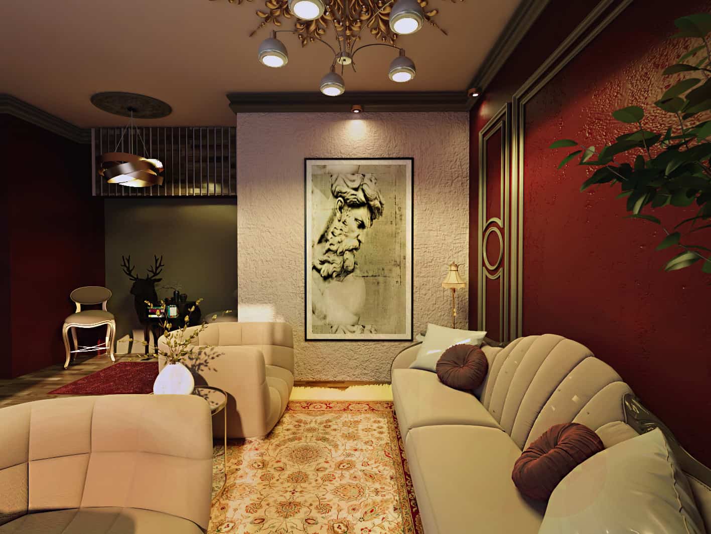
The design of the reception room is mainly inspired by the fusion of both classic and modern styles, and what happens as a result of their integration.
I mainly relied on focusing on color connotations such as the dark red color and what it suggests of its luxury and nobility in classical
ancient times, and the light pink color, which is used frequently in modern times, as well as the furniture that combines classic and modern without contradiction, even the artistic painting hanging on The wall is the original of a classic statue
The main plan was to try new contemporary design , my target was how we could add one style to another one without any conflictions . within it can be a good plan for those who love the luxury of the classic items and the low cost of modern functional furniture which is almost simple in usability
My reference was from my background of art history and directions Throughout the ages
, which could tell us a lot about the indications of color, that was the main idea …colors could effect on how you feel. the dark red which we see a lot in ancient classical times in Palaces, cathedrals and luxurious places, and light rose which is mostly used in our time ,also the decorative items like the classic frames on the wall or in the room ceiling even the painting on the wall, all of that makes us feel that we are in a classical palace , in the same time the modern items enter the scene to add more simplicity
Between praise and criticism, I learned a lot of color harmony to make the eye more comfortable while watching these scenes of the project , also I have learned the best choice of furniture pieces and how we should put them in order


