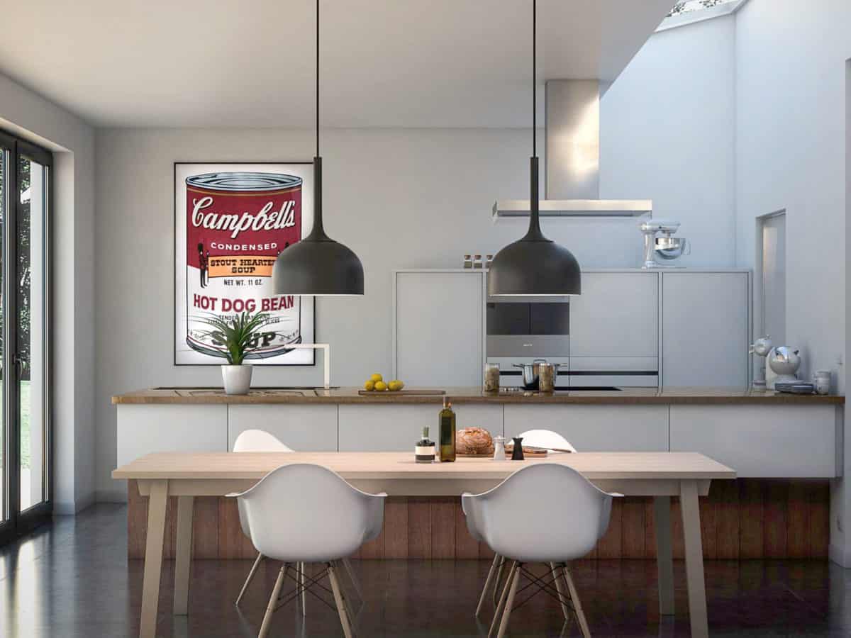
Part of a complete house renovation, this kitchen was completely designed by the clients themselves. To understand and interpret their idea(s), they asked me to create visualizations of what they envisioned. Although the creative part was more or less out of my hands for this project, this did, however, gave me the opportunity to really, and basically only, focus on the details of the render & post-production part. It’s always a pleasure to be able to spend some more hours playing around with light setups, more in-depth material creation, and Photoshop, for certain projects.
The purpose of these visualizations was for the clients to have some imagery to sell a newly renovated house. A big part of that is convincing people, so proper renderings always help! I tried to translate their idea(s) into some images.
The complete design came from the clients themselves. They basically envisioned everything, but needed photorealistic visualizations in order to make sure that what they were about to sell had a proper look. Obviously, as an artist you’re always inspired by the people that you consider to be the best in your business. In my case those would be photographers and fellow CG artists.
To be honest, I still consider this to be one of my best works. Not only because the result ended up so well, but mainly due to the fact that people can relate to the images. After I posted this on my personal Facebook page, people commented that they really liked it because it reminded them of a normal kitchen. No over-the-top design or fancy furniture… Just a normal kitchen, like most of us have at home.


