The project is part of an apartment remodel in Downtown Bucharest, done in 2012. It consists of an entire remodel and renovation process for the living room, dining room, bedrooms and bathrooms. The project was done in a team of 3 designers, with me included.
A warm combination between classic and modern style was requested, and here we have the result : custom furniture, interior joinery, a rigorously chosen color palette for the walls and decorations. Since the living room isn’t quite big, the choice of a large back wall made of black glass was done to enlarge the space, instead using a mirror. This way, the living room space remains a relaxation space and not a superlative of itself.
In the dining room area, borders to imitate the presence of former wall pictures were added, also an intermediate profile to create a subtle vertical spacing between the “screens” and dining place. This area was kindly designed, without being populated with useless objects and decorations, thus it’s only a place to eat, and you don’t need to be much distracted.
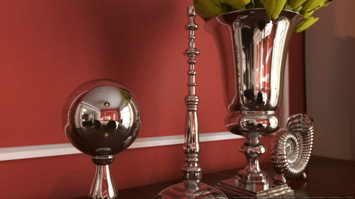
Through these renderings I wanted to revitalize the project and give it a better atmosphere, with more attention to details. They were done in Corona renderer, within 2 days. It is a powerful software which gives you possibility to better and faster view of your ideas.
The remodel project of the apartment was done for a young family, which wanted a warm and livable space, with well combined classic and modern furniture styles. Though they wanted to make a wider space without adding lots of furniture and decoration objects.
The design style doesn’t exist. It’s pure eclecticism : warm mixing of classic and modern, with unique furniture and decoration objects.
Materials are a middle course between cost and quality. You can make a very nice design without necessarily using expensive materials.. with expensive looks.
Colors are a combination between rough contrast, light and dark tinted areas, such as the grey and light garnet walls.
The black glass.. it has a great story. Our firm had this element, black and colored glass accents on a single representative wall, in this case, the TV backwall. It gives the idea of space enlargement without oversizing the area, which could’ve happen if a mirror was used.
There was a lot to learn, especially from client’s rough and on the go requests for changes. Also, from the CGI part, where lots of tests were made to achieve good and selling images. We all know a good image sells better and will also sell the next time.
- Interior Designer: Diaconescu Valentin-Aurelian


