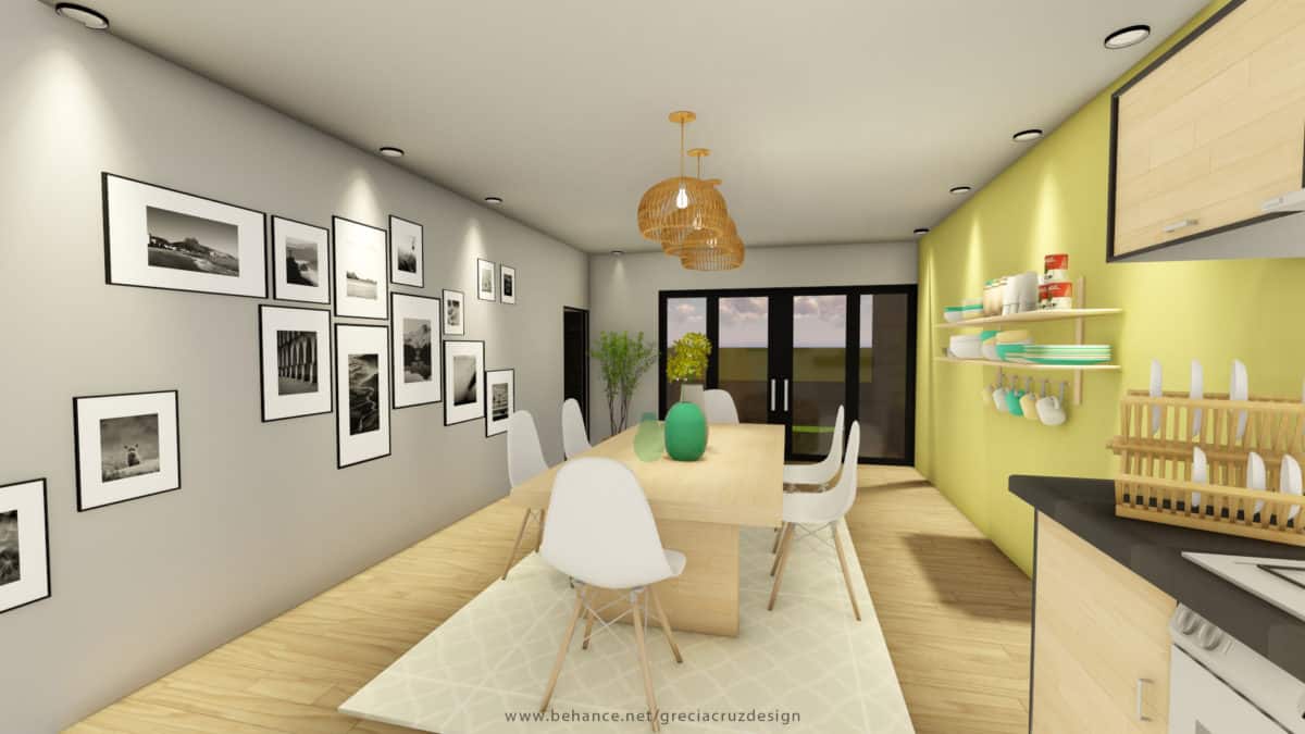
Finalist project of Concepts in Color 2017 – Sherwin Williams, El Salvador.
Capvespre has as meaning, sunset. It is born from the idea that to transmit to the users sensations of warmth, tranquility, serenity; sensations that a golden sunset transmits to us in the same way. It is intended to provide the user, spaces where you feel in contact with nature from the comfort of a space that represents your home. Implementing for this, the Nordic style that has been adapted to the general needs that a person or group of people in a home can have.
Other sensations that are represented in the space, is the unity and family coexistence, tranquility and freshness, placing plants or natural elements in the environment.
The Nordic Style was used to represent the space, because it is a very clean architectural style in terms of details, sensations and colors. It is popular for its use of white, that is why it has been applied as the main color in the project, using as accents of green color and making contrasts with the wood in the furniture.
The sensations and mainly the combination of colors were the final decision for this style to represent the collection “Simple Refine” (new collection of colors of the Sherwin Williams brand) in the main areas of the home, such as the living room, dining room and the kitchen.
The living room, is the space that welcomes you when entering a house, its one of the main areas where they have meetings, celebrations, etc. Followed by this, we find the kitchen – dining room, these are parts that complement a home, these spaces allow family coexistence at meal times, it is a moment in which some people meet to share moments and talk about their day and other family topics.
In spaces like these that are the common and main areas that make up a house, you can create moments and memories that remain in the memory of people who choose to create that coexistence to unify the family
It was for a contest of “Concepts in color” of Sherwin Williams at international level, where the participation of countries like El Salvador, Guatemala, Honduras, Costa Rica, Panama, etc. In it, they had to represent different types of spaces, interior or exterior, in which they applied their collections of colors for the year 2017. My project was chosen as one of the 10 finalists of my country, El Salvador.
I chose the Nordic architectural style, because it represents me in its entirety for simplicity and cleanliness. I was inspired by the colors of the “Simple Refine” collection by Sherwin Williams, since they are clear tones, like whites, grays and contrasts like green, those colors evoked me to a fresh space, that without needing to be big, could be achieve this sensation in the path of tonalities.
The reactions of the people who saw my project, were quite favorable. Many people loved him, even though the space was simple, I manage to represent the main sensations that I wanted to transmit in him. It was a very satisfactory project.
With this project I learned to take risks, that even if you are afraid you must dare because it’s worth it, see the results and succeed in what you want.
- Interior Designer: Grecia Cruz


