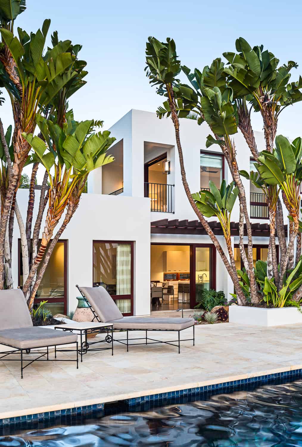
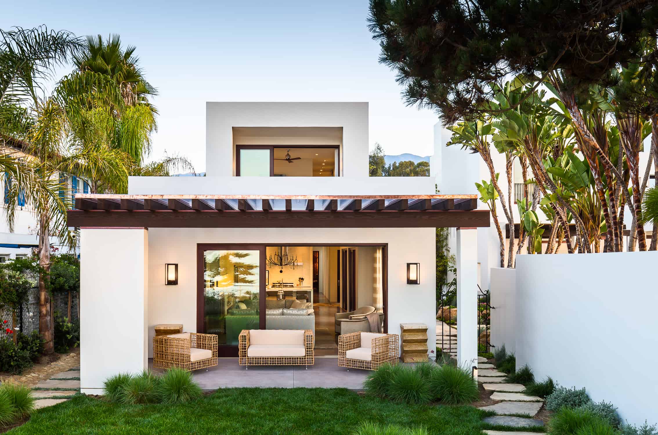
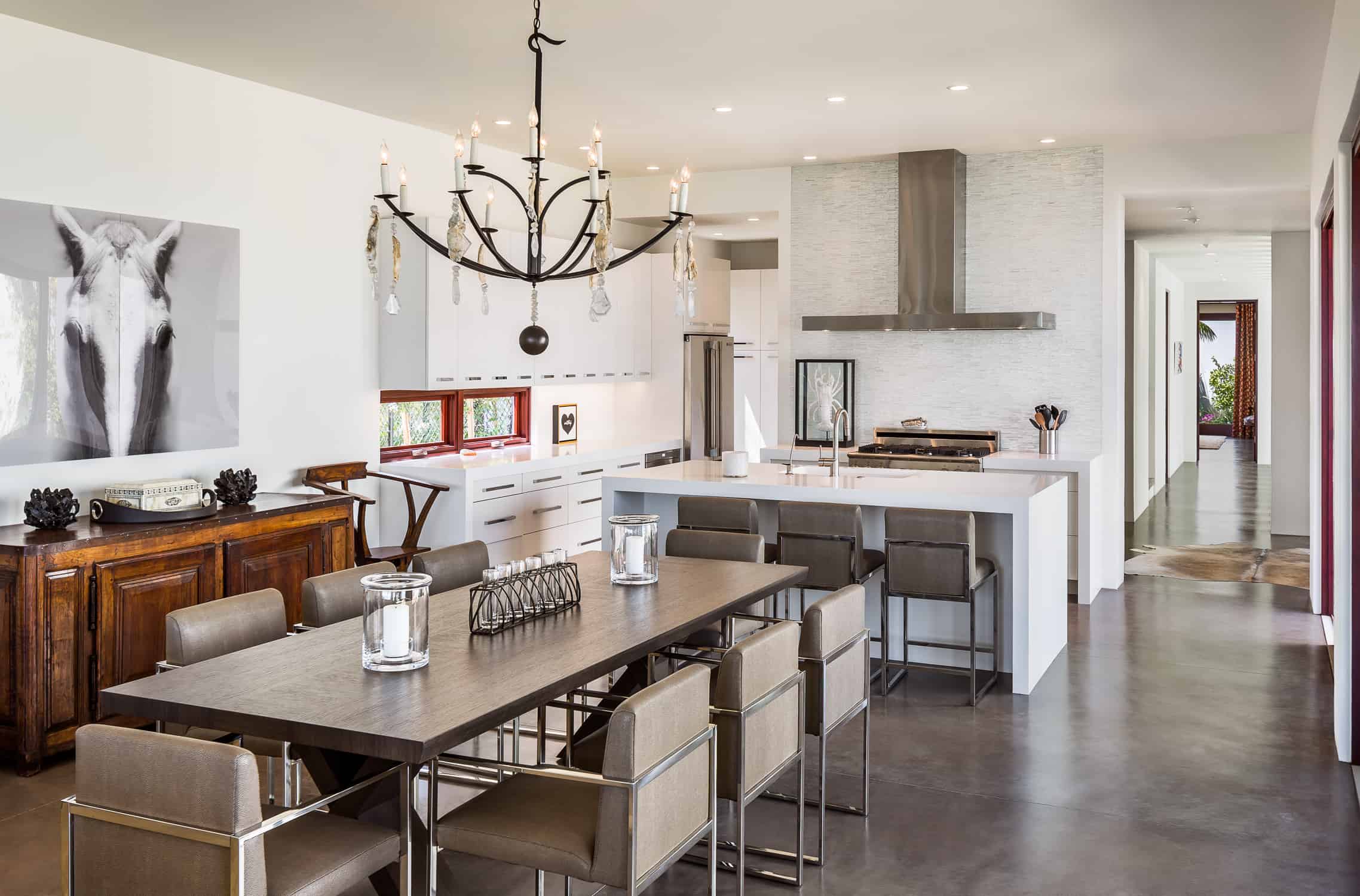
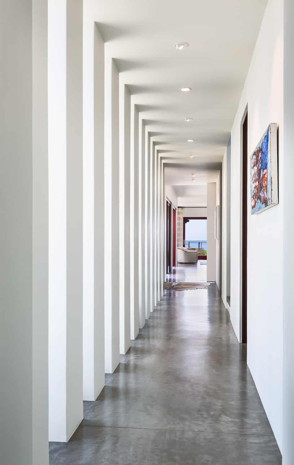
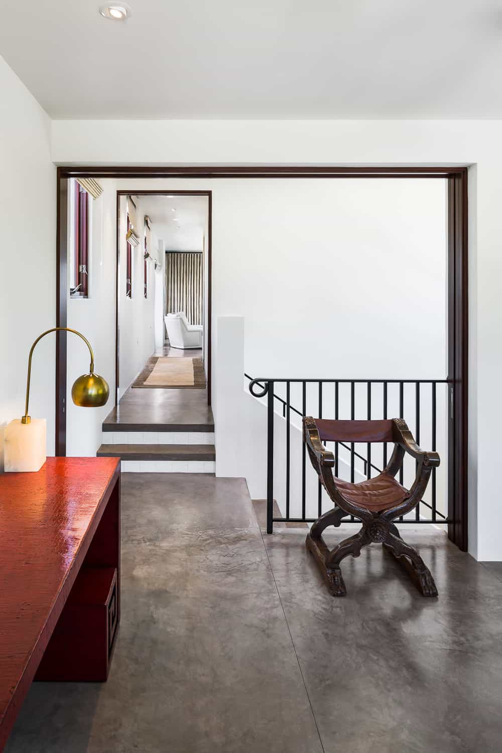
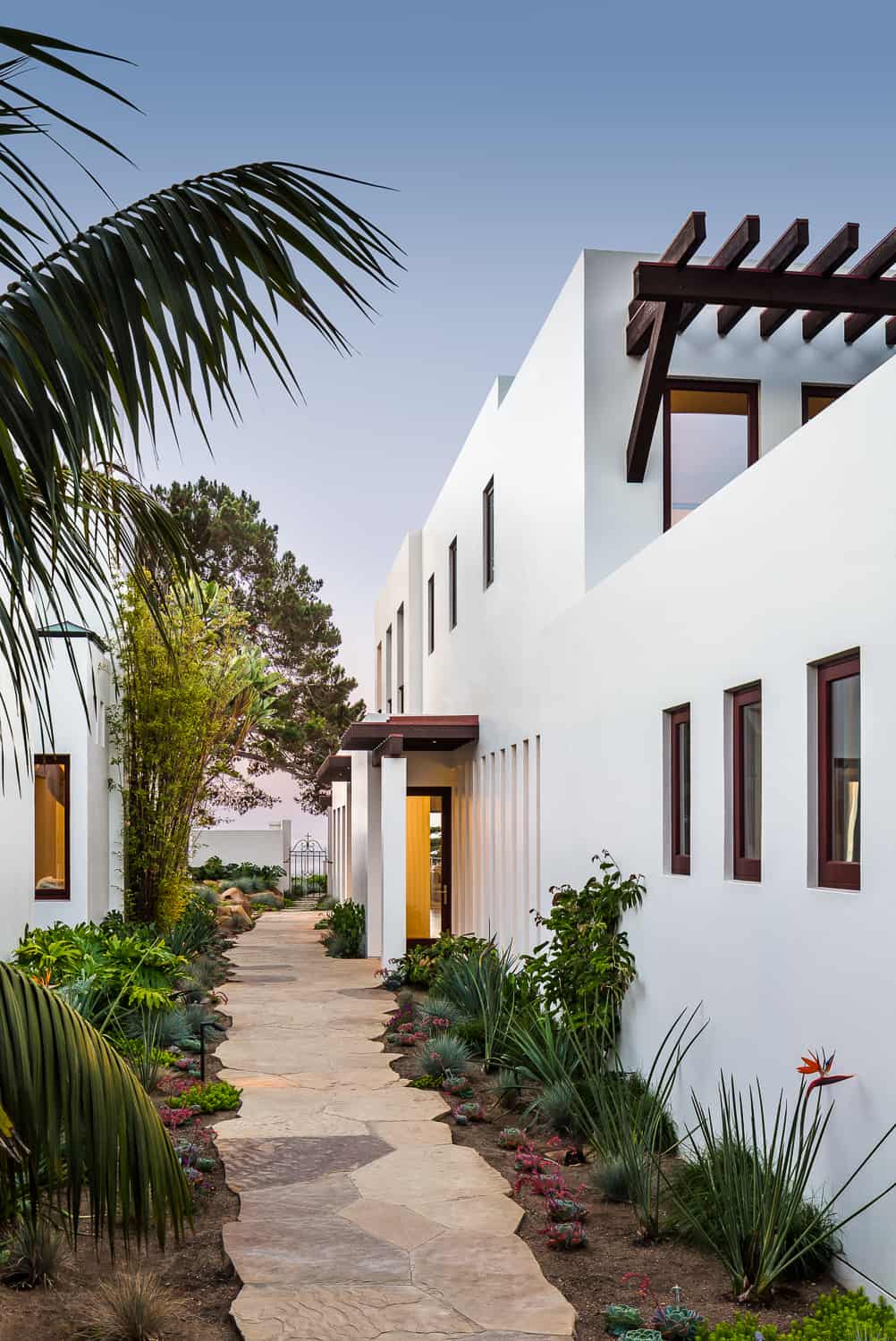
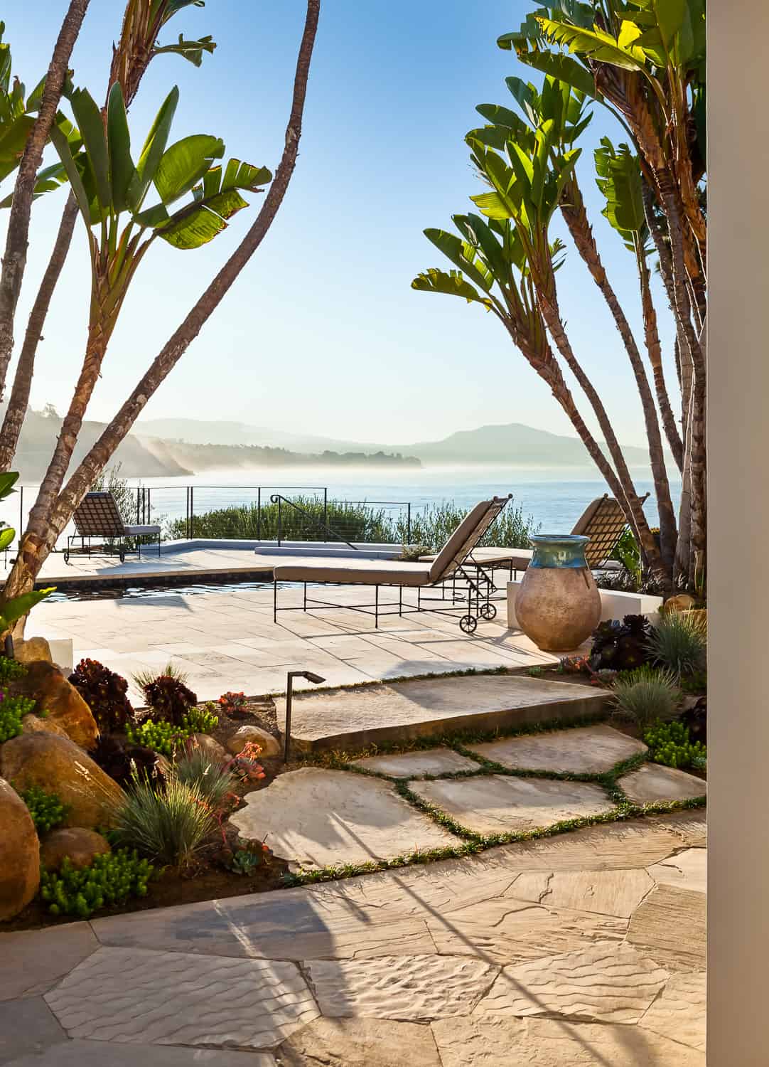
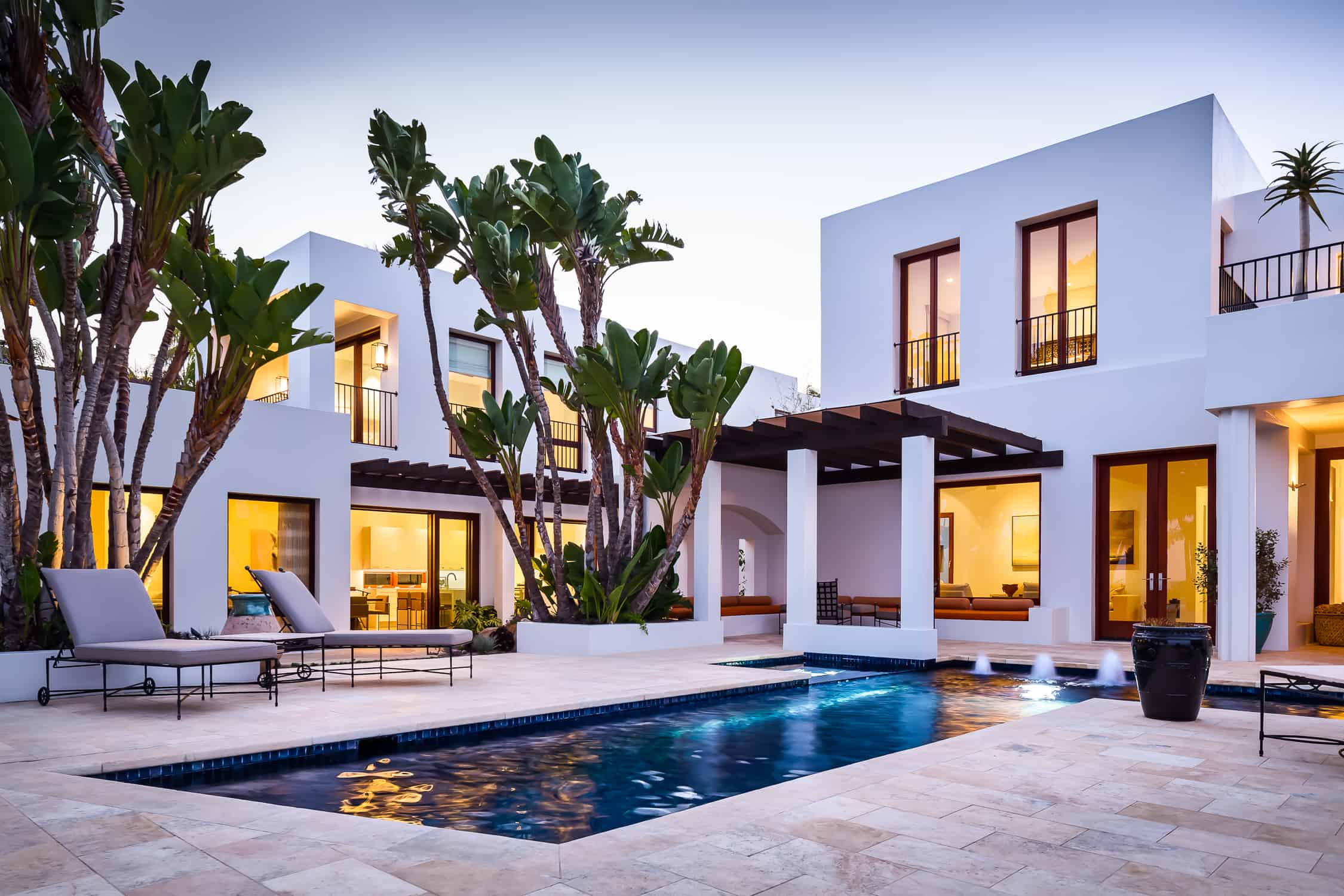
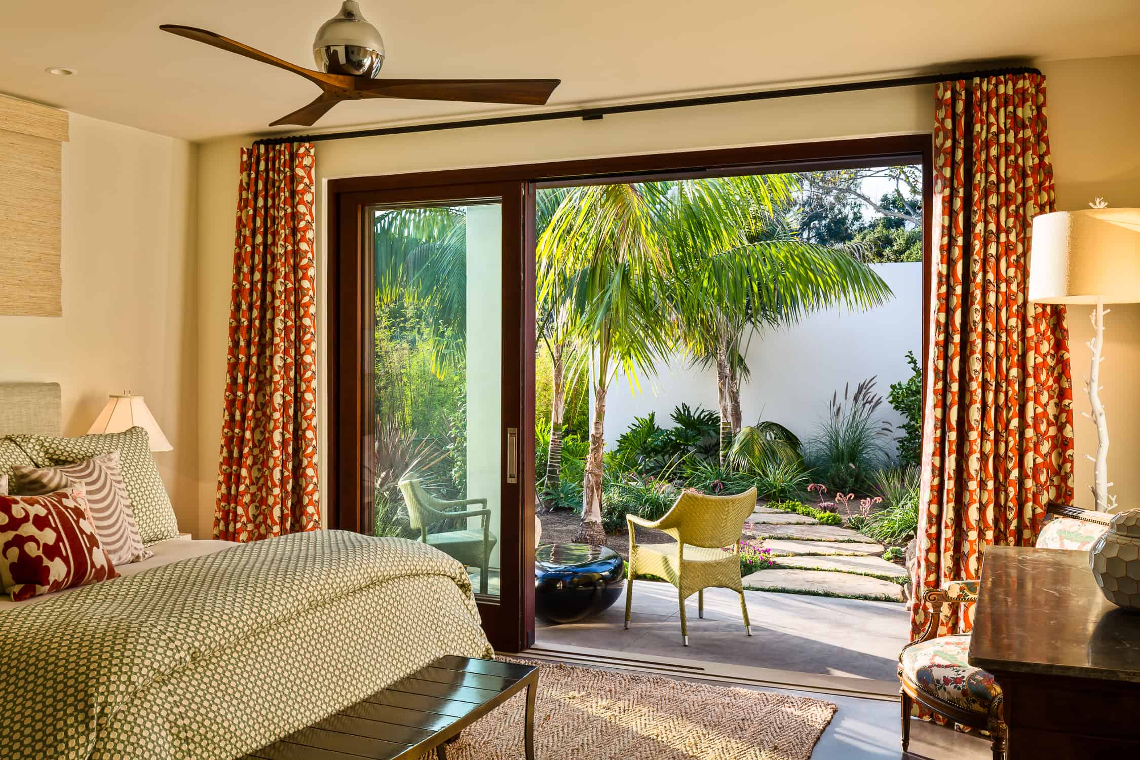
On a secluded lane with blufftop ocean/ island views, neighboring properties were purchased by the same owner – one with an existing primary residence, and the other an undeveloped .3 acre lot averaging only 35‘ in width. While the existing larger home underwent an extensive remodel, plans were developed for a new residence on the adjacent narrow property to function as guest accommodations. The challenges were to create a comfortable home with a feeling of spaciousness within the site constraints, and to blur the boundary between the two lots, connecting them for shared communal uses and opening views, but maintaining privacy for the occupants of each. The biggest gestures on the exterior were the removal of a plaster property line wall and the development of a lush and intimate shared tropical garden that greets guest, leading them to each entry. The new home was designed in the same bold yet simple modern style, mimicking the palette of materials and proportions, though scaled for the constraints of the smaller property. The design solution utilizes strategically placed openings in the solid mass to capture important views and connect with the outdoor lounging and entertainment areas. In keeping the palette of materials and colors simple, the living spaces feel far more spacious than their footprints reveal, creating zen-like interiors. The bold plaster exterior is warmed with stained mahogany doors, windows, and trellises. Concrete floors and simple white interiors punctuated by warm, natural textiles add to the visual spaciousness and calmness, creating an airy retreat.
Our client came to Santa Barbara looking to create a retreat as a counterpoint to the heat and dust of the Central Valley where she manages her family’s extensive cattle, horse and citrus ranch. The plan was to design a new guest house adjacent to the existing primary residence that would function for both brief and longer stays of family and guests. The two homes had to complement one another architecturally, function communally for larger entertaining, but at the same time maintain adequate privacy independently.
Though our client started her home search looking for something in a Spanish/Mediterranean style, the existing home had a bold, modern simplicity that really appealed to her. The simplicity of the architecture was warmed up with stained mahogany doors, windows, and trellises, and plenty of comfortable outdoor areas, as well as a pool. The new guest house was designed in the same simple, modern style, mimicking the existing palette of exterior materials and proportions, though scaled for the constraints of the smaller property. Simple white interiors with colored concrete floors make the home feel more spacious by avoiding too much contrast. (The 2700 square foot 3-bedroom guest house is 105 feet long and varies in width from 17 to 22 feet. The property is over 400 feet long and only 35 feet at its widest point.)
The challenge with the design of this home was to create a comfortable retreat for guests that felt spacious despite its modest footprint within the narrow site constraints, and to blur the boundary between the two properties, connecting them for shared outdoor uses and opening up views, but maintaining an adequate amount of privacy for each. The modern simplicity creates a relaxing atmosphere for guests, and the palette of materials is durable and comfortable. Based on owner feedback, the house is used frequently and functions great!
- Architect: Mary Andrulaitis, Partner / NMA Architects
- Landscaper: Eric Nagelmann, Landscape Designer
- Home Builder: Quiring General
- Photographer: Ciro Coelho Photography


