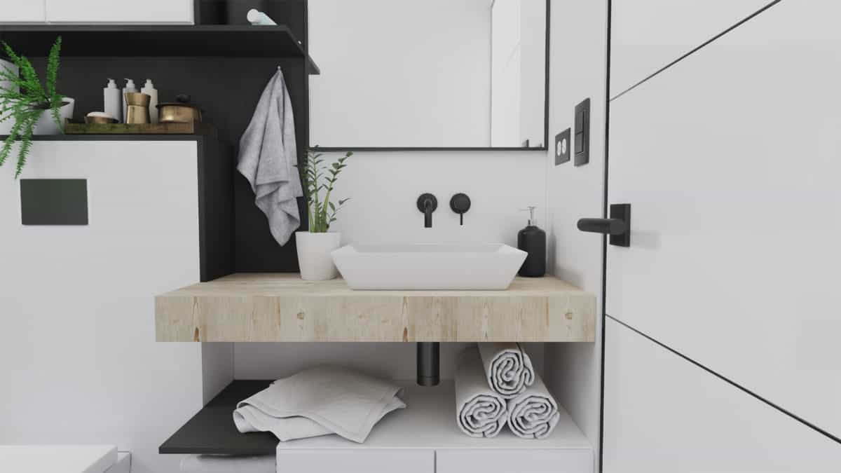
Minimum space needs maximum design strategies. This small bathroom remodeling project was designed to look more spacious. Even though the existing furniture footprint remained almost similar, the design makes it feel bigger than it actually is. The neutral and natural colors were also a big part of the aesthetic improvement.
The goal was to remodel a 3 m2 (32 sq. ft) bathroom for a small family. The main purpose was to improve the aesthetics of the bathroom, however, it became necessary to optimize the space by redesigning the existing furniture.
We’ve always thought that neutral colors can ameliorate any interior, conceding a sense of order in which you can create specific focal points that draws attention to the user. In this case the wooden basin base became our striking element, creating a contrast of colors but maintaining the essence of the general proposal.
Not many projects have spatial requirements as challenging as a 3m2 room. This project taught us a lot about furniture design, considering there was never a lot to add to begin with. Basically just had to rethink what already existed, and that is very important in our field.
As architects, sometimes we try to complicate ourselves more than necessary, always trying to create something incredible and unique. But there will be moments where we just need to keep everything as it is… but better.
- Architect: André Canales
- Architect: AURUM Studio


