Interior design concept for real estate agency.
The customers intentions were for the apartament to look affordable but “fancy”.
As a result quite male interior is designed in a minimalist style, using easily accessible materials.
The apartment, suitable for 4-6 people, is intended for purchase and then short-term rental, so if you ever come to the Polish mountains, maybe you can spend the night here.
The project was made for real estate agency.
The customers main expectancy was to make an affordable to build and furnish modern apartment.
At the same time, the project was deemed to meet the assumptions that were supposed to fit into the market – while being original in its own way.
Customers wanted to sell the project with the estate.
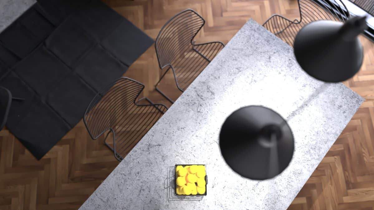
The main material is concrete, which is really rough and modern and can be replaced with cheaper spplements without losing its look.
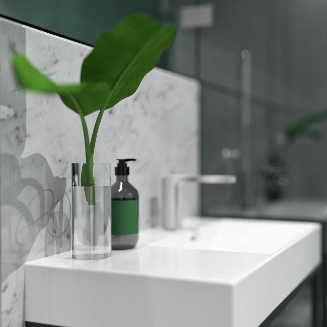
The additional colors are graphite and black steel details, giving the interior musculine look.
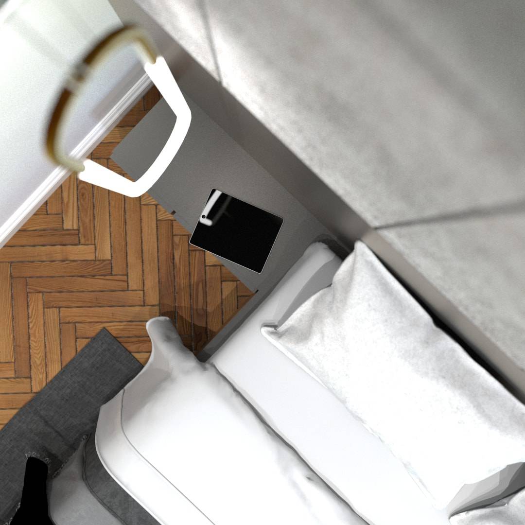
Not to make the place too dark I used parquet an a little bit of green color.
It is known that “tastes are not discussed”. Many people reacted to the project with enthusiasm and appreciation. A few people did not like it, for which I do not blame anyone.
For me, the most important thing is to act in harmony with myself and my design intuition and not to do something, only to the market.
At the end: customers loved it.
- Interior Designer: Zuzanna Procner


