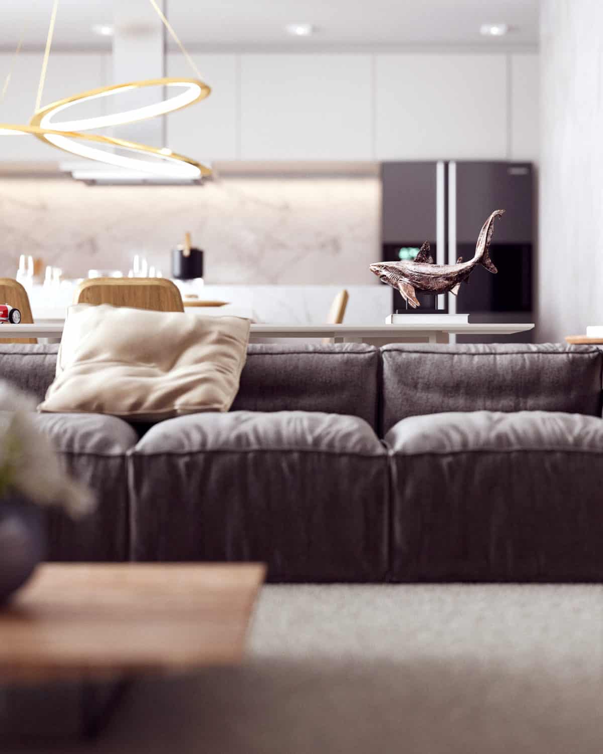
Scene created and developed for a clean and comfortable environment with neutral colors and tones. The idea would be to leave a whiter environment, with plenty of light, so it would be an environment with natural light. I was very pleased with the result
This project was a challenge, the idea was to draw attention for simplicity while valuing the space and that was fully integrated, with kitchen, living room, barbecue and balcony, an environment that transmits according to simplicity, the same time and light natural.
The idea was to use neutral colors and textures, with light tones, nothing too flashy, a light porcelain tile for the floor, white wall tone and a shabby gray style. The kitchen part also white furniture, with a wall part and marble countertop.
I was very happy with the result, people really liked this project, had a lot of votes on websites and architectural visualization groups. Several specific angles have been made to enhance and enhance the detail and composition of this scene. Finally the result you already know, it was nice project to see.
- Interior Designer: Gustavo Tassoniero
- :


