When the company that hires you gives you full on creative power to design and build the office of their dreams, it’s something that resembles a calling. An urging voice pops in your head and all you can do and all you can think about is the project in question.
The responsibility is enormous, specially being a young architect myself. But your confidence comes from their confidence in your work and the result is as rewarding as can be.
This project is, at the same time, groundbreaking and sophisticated. Hope it serves as an inspiration for you as it was inspiring for me to design it.
This project was designed for an innovation firm in São Paulo, Brazil, called “Criar.me” (translates to “create.me”.
Their work is about technology and their values include transparency, great design & all there is in the revolutionary world.
So, this office was thought to represent all that and more.
I had an architect collaborator with me on this project (Carolina Revoredo) and together we designed it.
Coming up with the style was a great mix of us two: she is more of a classic with a twist and I’m more of a contemporary-revolutionary architect myself, so we complemented each other!
Inspiration comes from any and everywhere and of course Pinterest & Instagram are always great helpers, but the references we used were mostly our own unique background in architecture.
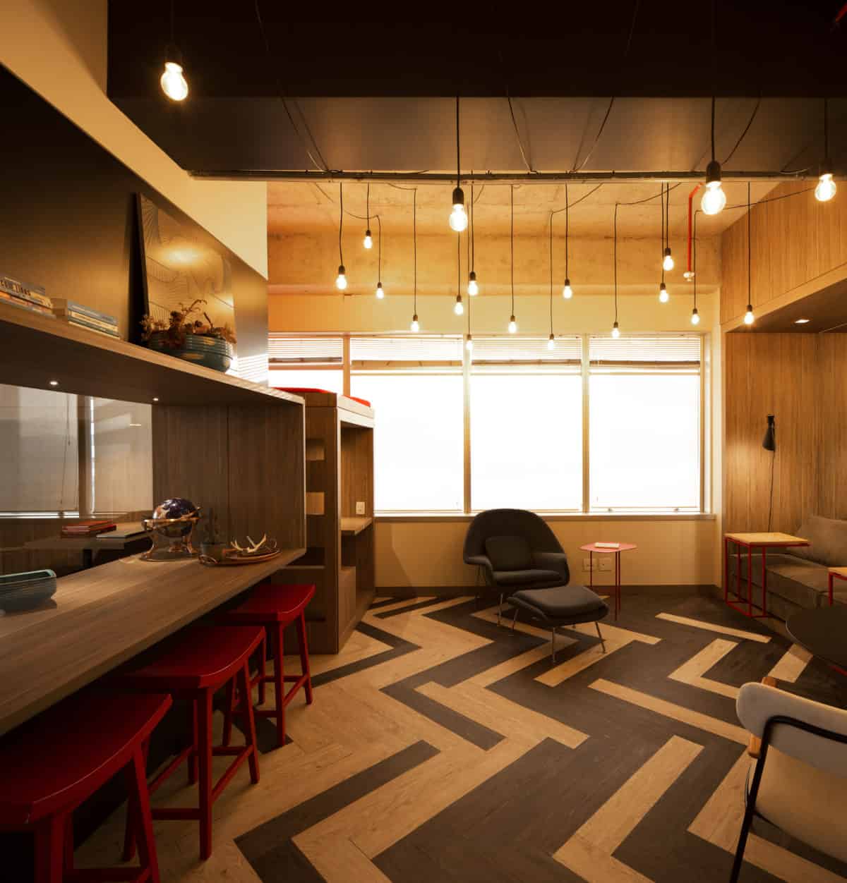
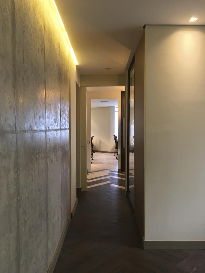
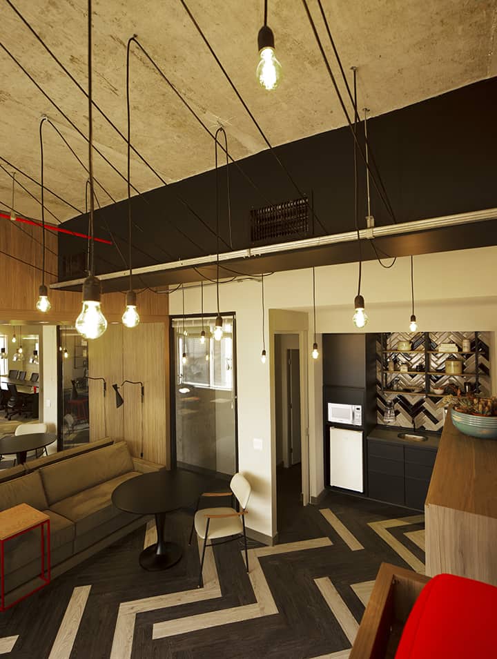
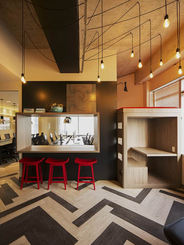
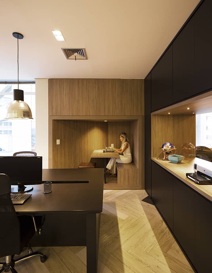
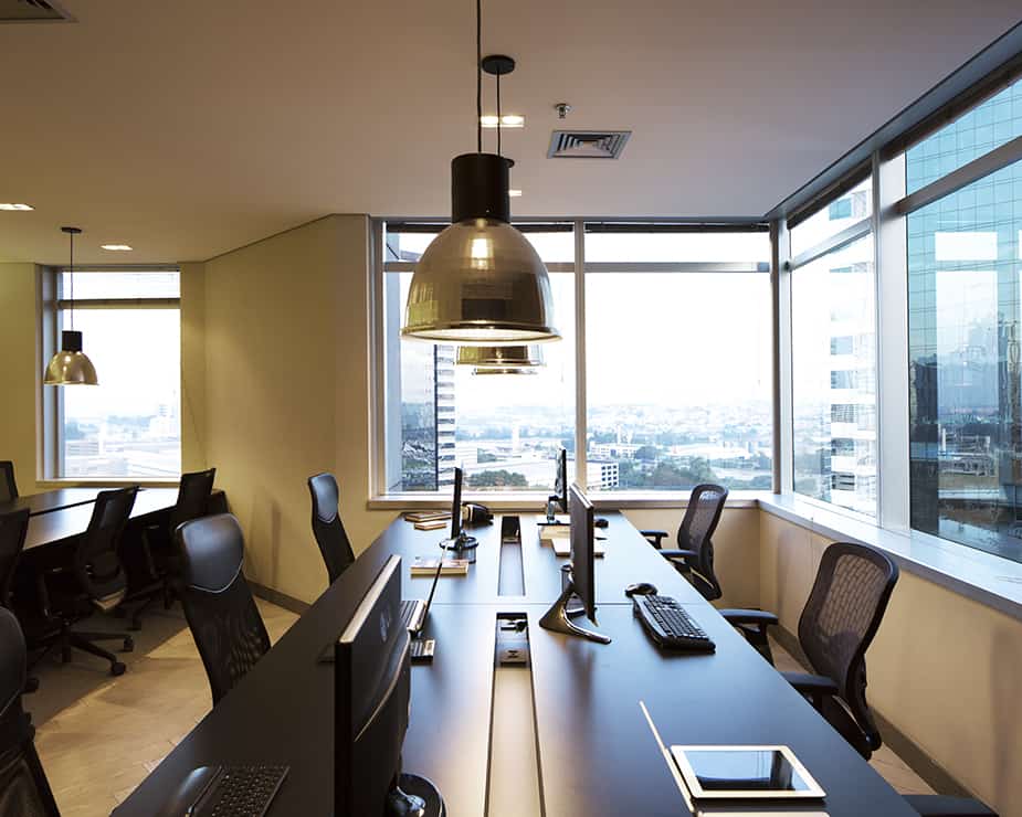
We decided to design an office that was simple in floor plan but elaborated on the tridimensional level, so one can go from the entrance to the workspace with as little detouring as possible.
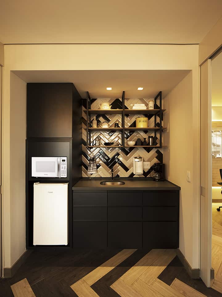
The impressiveness of the tridimensional space starts with the use of 3-colored vinyl floor slats in a chevron pattern on the floor and a double high-ceiling glass frames for partitioning the meeting room (plus a high-ceiling black door). That way, you can sense the boldness & creativity of the office from the entrance; The rest, you’ll be able to see for yourself in the images.
Criar.me’s team loved the project! It was no surprise, since it resembled the 3D model a lot, but seeing it done & in person gives it a whole other impact.
They say that when having meetings there, clients and other staff are always amazed with the design of the office and the way it transformed the space.
It exhales Criar.me’s essence and that is simply the best result any architect could hope to achieve.
What I learned with the project is that the client, most of the times doesn’t know what they want – even if they think they do.
It is always a great point to start with, the client’s perspective of the outcome, but the design should be based more on their needs for the space and what they expect of it rather than on what they think of the final physical result.
I’m not saying that if a client has a romantic style you should ignore it and make an industrial one just because you like it better.
But I’m saying you can’t be afraid to be daring.
In the end, you are the professional designer of the space, so it is up to you to create something extra-ordinary.
- Architect: Patricia Putz Arquitetura
- Interior Designer: Collaborator: Carolina Revoredo Interiores
- Photographer: Manuel Sá


