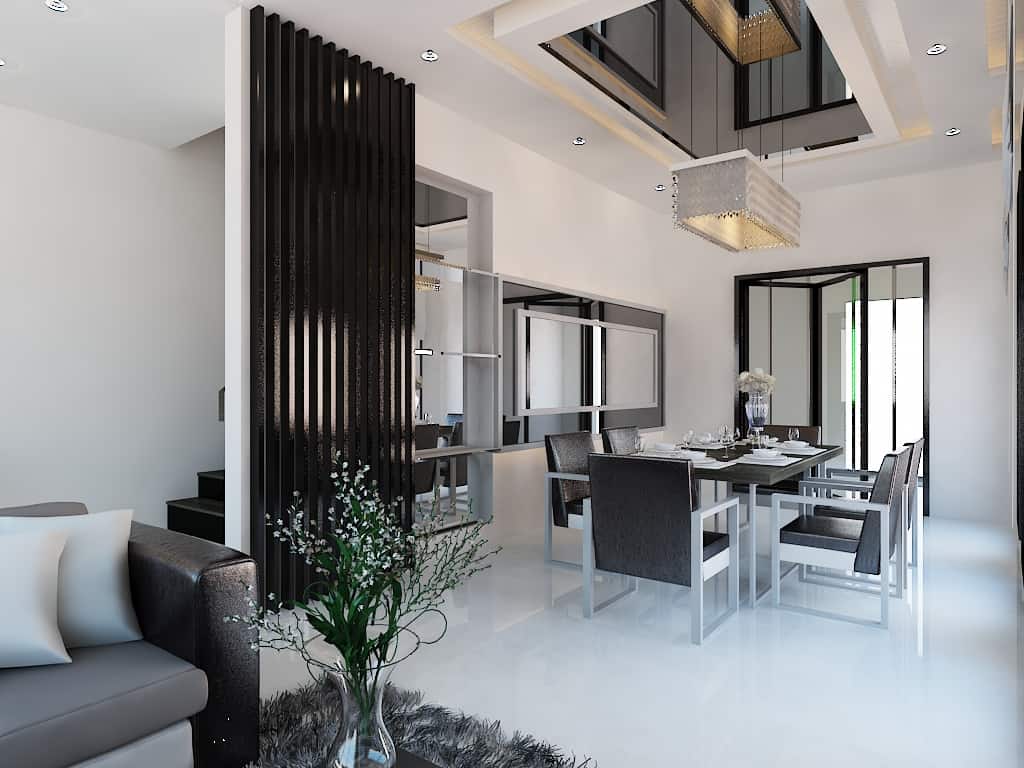
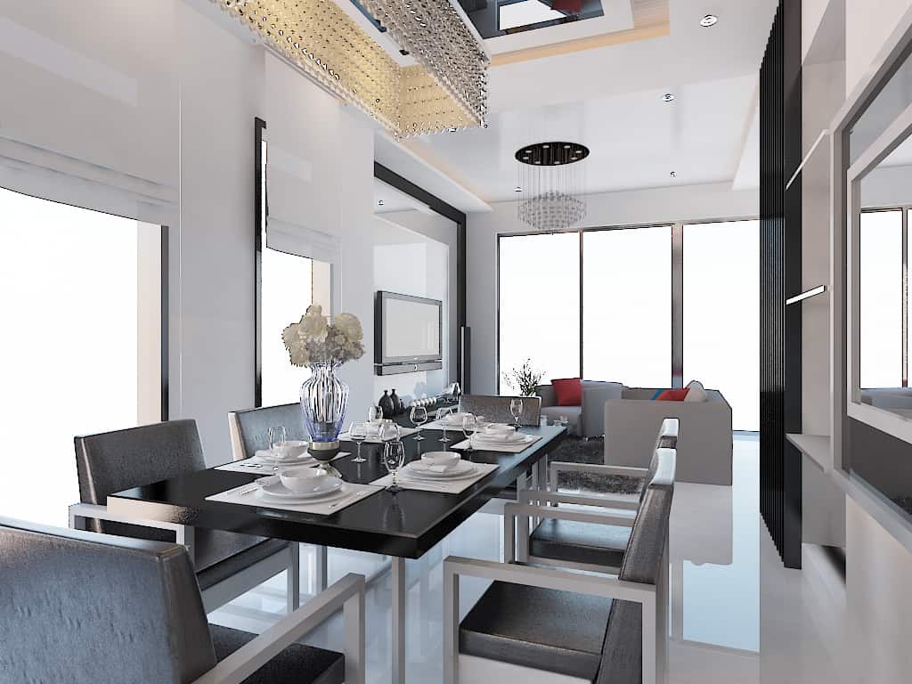
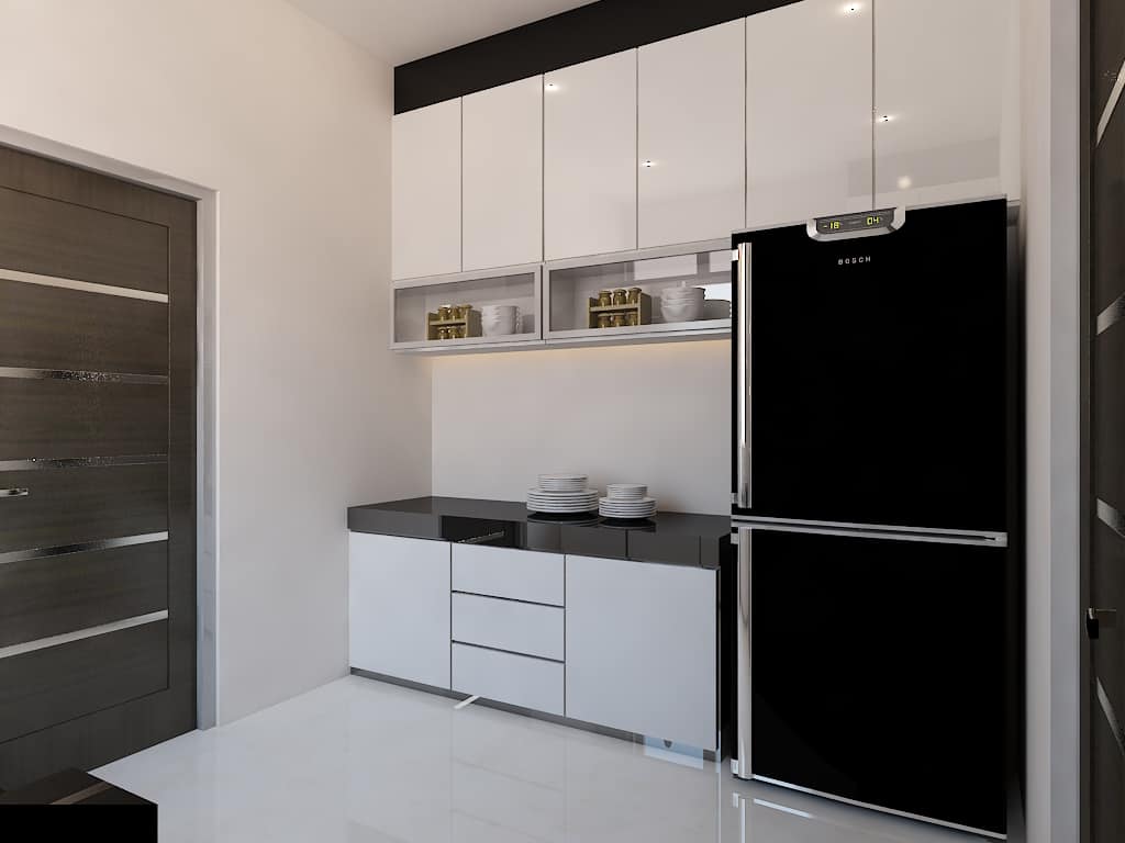
This project were designed for a young couple that loves Minimalist Modern Space.
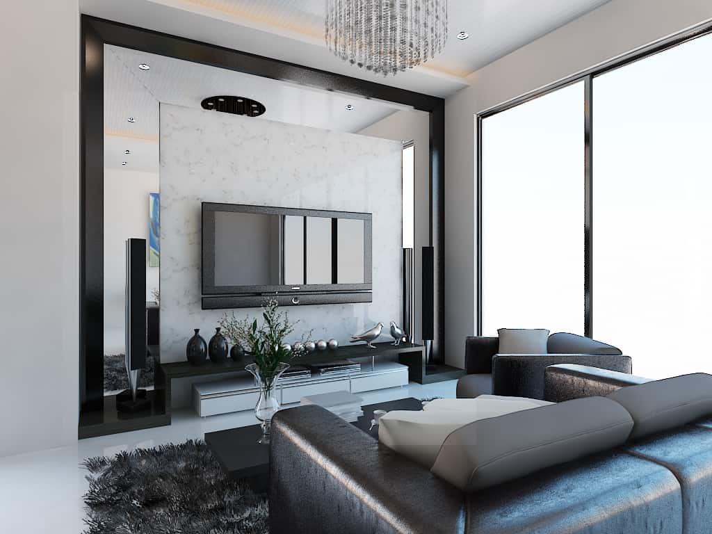
Which leads us in using black and white as the color scheme, with a touch of marble on the TV backdrop that makes the entire living room looks high end
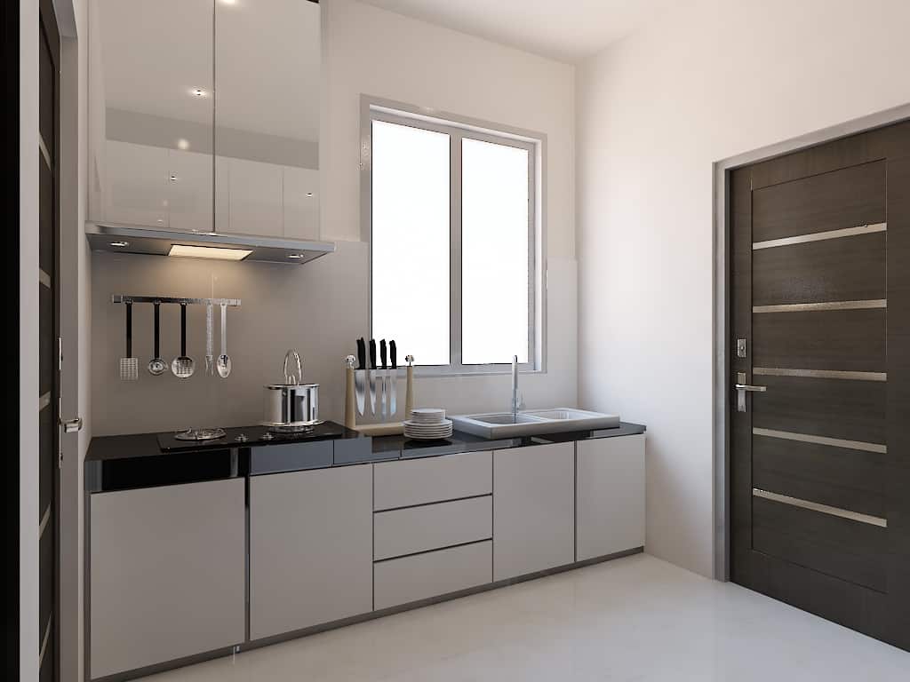
This project was introduced by a contractor. We are designing the living room, bedroom and kitchen. They describe the client as a minimalist lover. The goal is to make the space looks high end, tidy and simple yet not empty.
It was inspired by our ultimate “Less is more” minimalist Architect Ludwig Mies van der Rohe. Uses simple form and extravagant material like marble. The concept are to consider all parts, joinery and details are reduced until the stage where no one can remove anything from there to improve the design
Minimalist is all about less but not empty. Every component used in a space mean something, whether is to make the entire space looks lighter, wider, etc. Consider the essence of light, form, material and of course the human condition
- Interior Designer: Suhanti Tan


