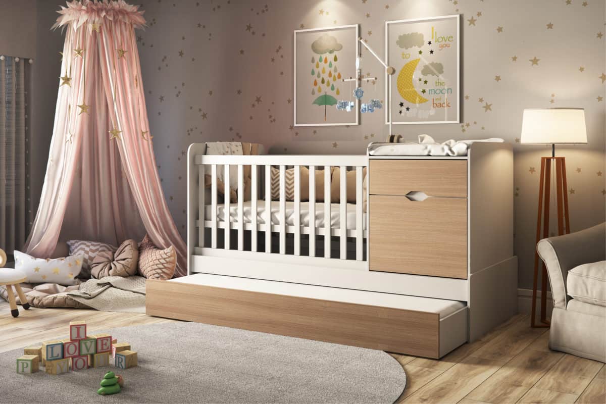
Images developed to show the cradle and its other functions.
The main purpose here was to create a beautiful environment but without losing the focus on the furniture that is the product to be presented.
For this we created an environment with pastel tones and a natural lighting with a focus on the product.
The plan was to create a beautiful environment with soft colors that could exist in a real house and create a desire to have the product in the customers.
It was created for a furniture factory called Atual Móveis.
Their goal was to create an environment that would show the real quality of their product and wanted more compelling image than they already had.
Style, color, and materials I needed to choose something that looked beautiful, childish, and did not take the attention of the furniture. That’s why I chose cool colors and pastel shades.
Many of my inspirations come from the environments that IKEA does, I really enjoy their work and how they think about each environment, creating desire in everyone who see the environment and makes all the environments as if they were being used at that moment.
People responded well, most liked the more neutral colors and they wanted to use something like that for their son. The customer itself liked it a lot and it exceeded their expectations.
In all the jobs people ended up learning something different, I learned about a mix of natural and artificial lighting, I wanted a main lighting to be totally natural but that had a little touch of artificial lighting just to give a warm touch environment.
In one class one day my teacher (Andre Castro) told us the following: “It does not matter what you choose to do for your life, but try to be the best”, and that’s the tip i give, find what you love to do and try to be the best.
- 3D Artist: Anderson Araujo


