Two spaces try to merge into one , the materials bring the dining golden place into contrast with the living area .
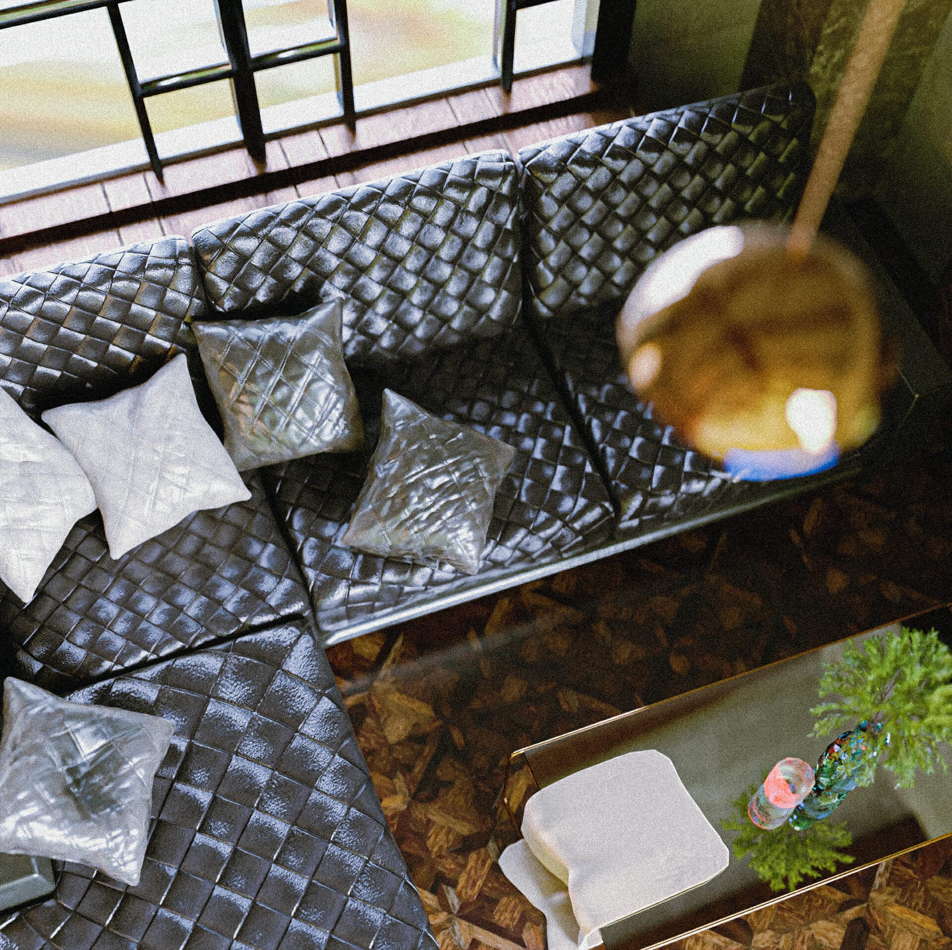
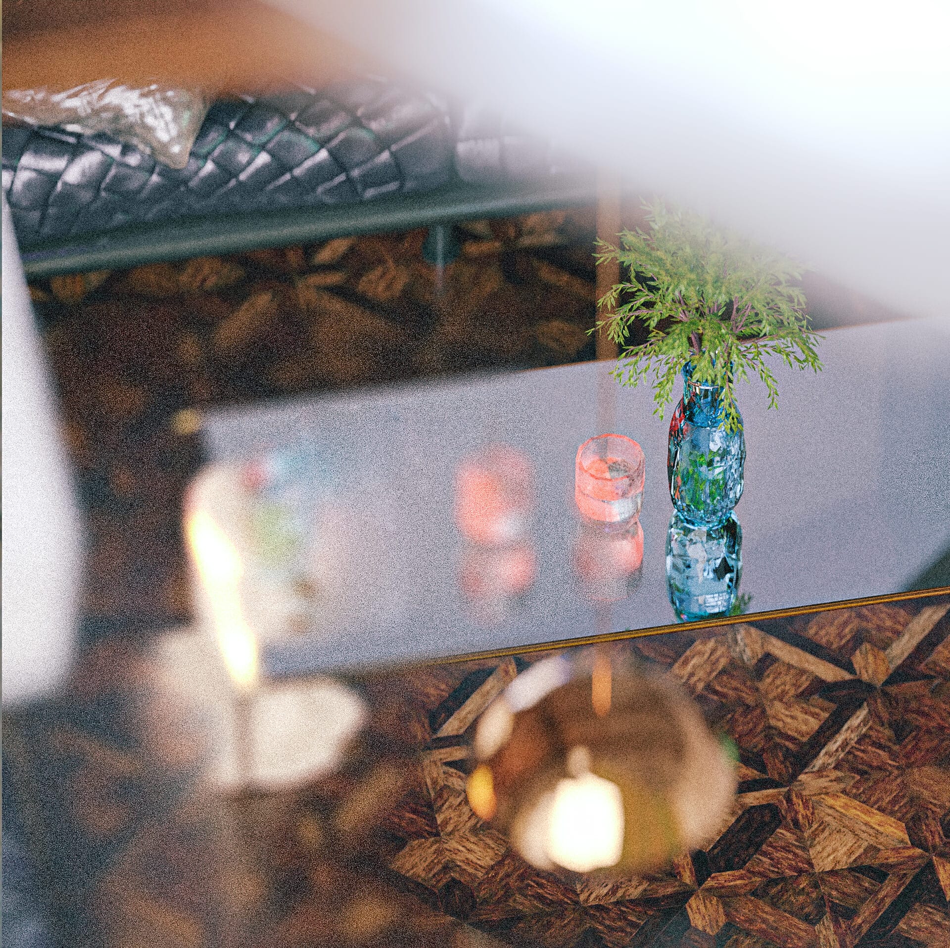
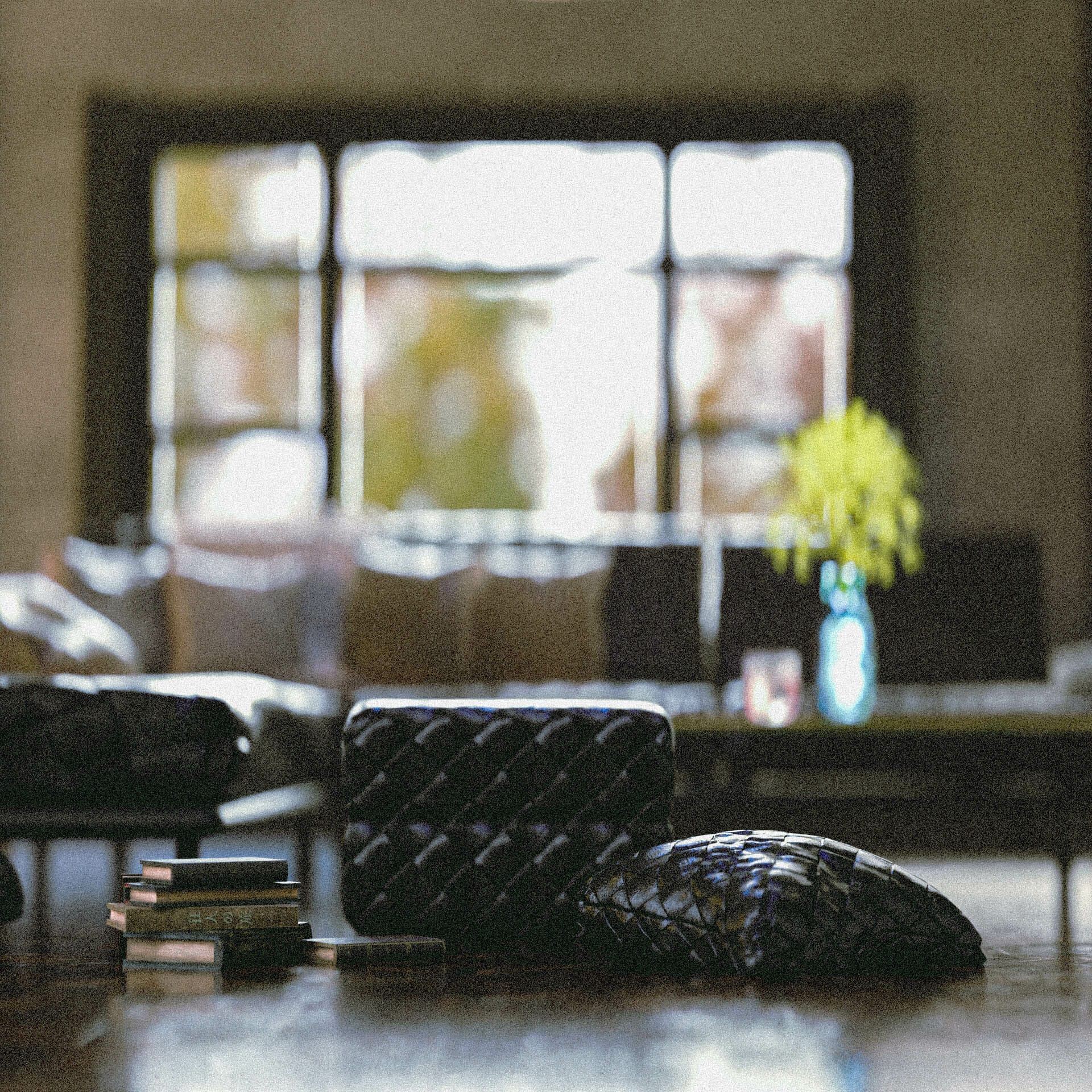
the living area has the classic materials of leather and the woody chestnut parquet , in the living room a space that is covered with parquet is playing as a focal point carrying the main points and items in the living room , attracting the viewer’s eyes .
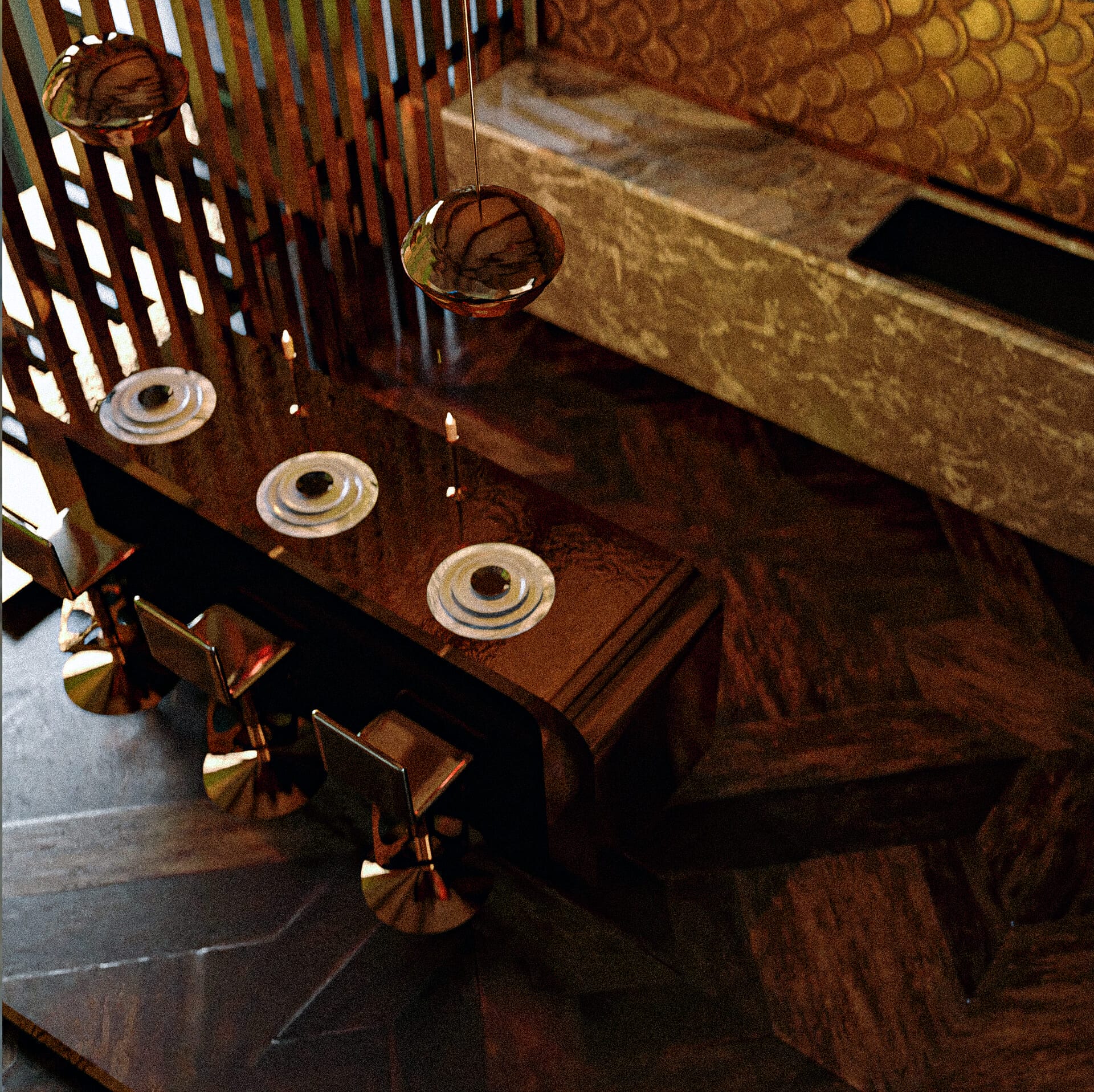
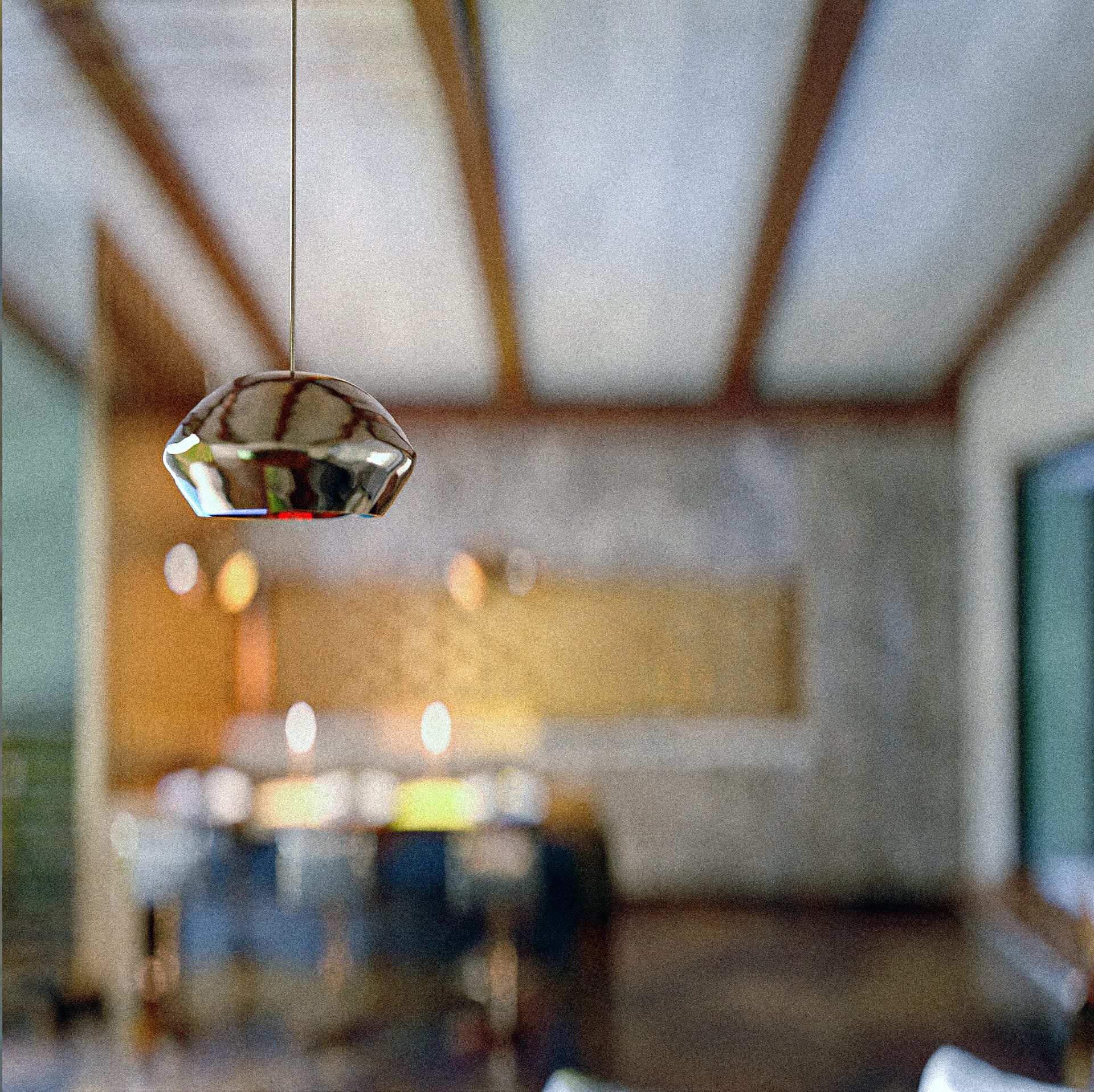
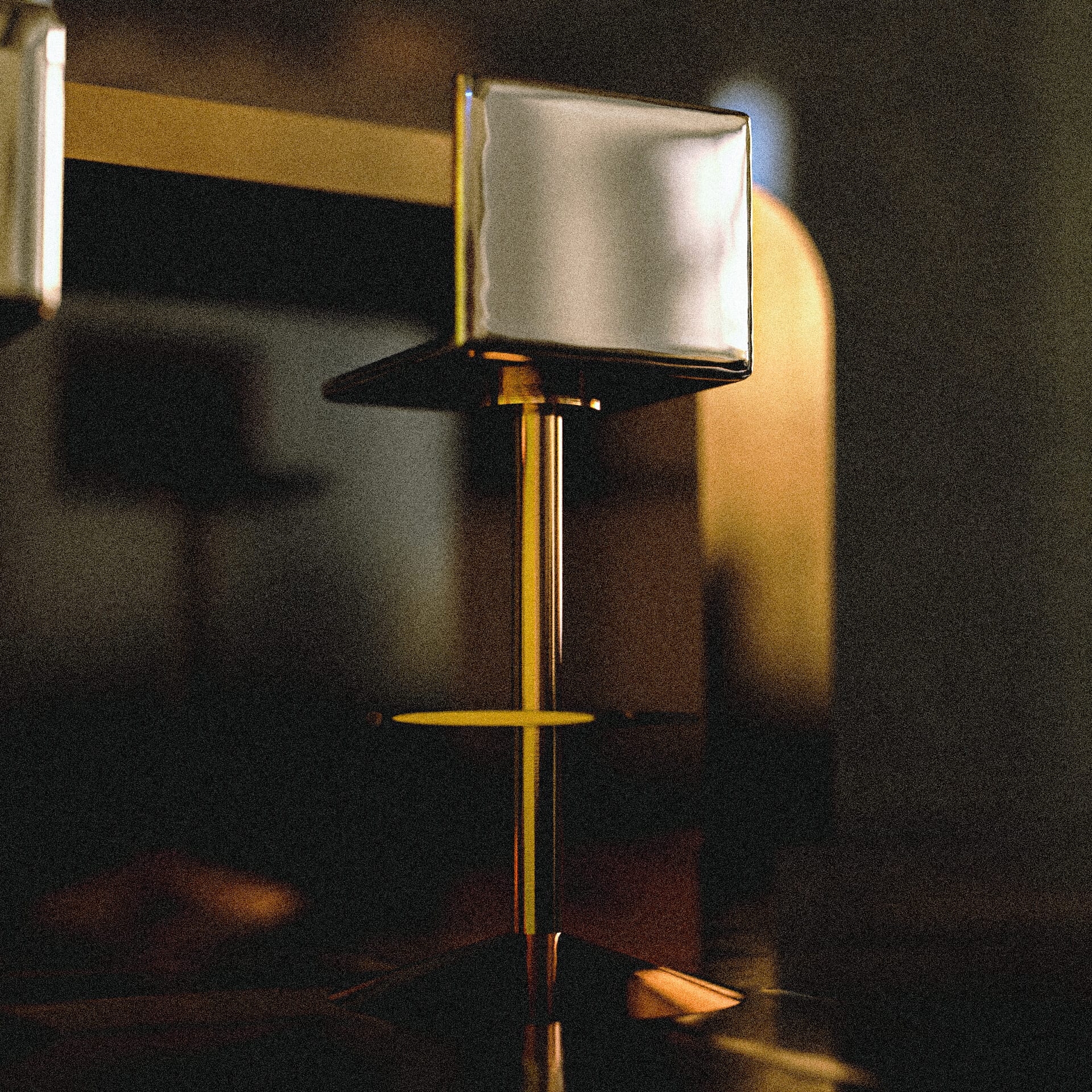
the dining place has three golden stools in front of a golden counter , the dining area has the two light fixtures that are lighting the area and giving it a more classy touch , on the right side a big window as well helps with giving the area the natural light .
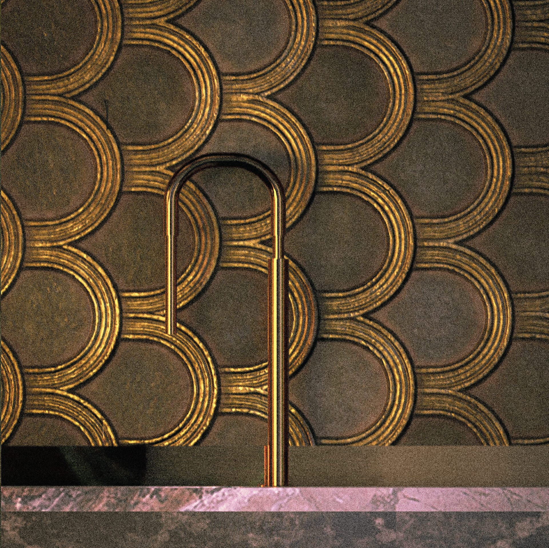
in front of the dining area two types of marble are chosen for the kitchenette, the faucet and the wall behind the faucet are both of a golden tones and the wall is accompanied with nicely patterned circular texture.
the ceilings is accompanied by exposed timber beams trusses which goes hand in hand with the floor material and gives the space a sense of unity .
this project was simply a plan to try to mix two spaces by visual identity and materials ,although it’s an interior project , it was more of a project to test materials and visualization aspects done and rendered fully using Blender .
the style started all from the golden color and then all the colors and the materials tried to mix up with it well ,classic yet modest and simple and visually connected .
I try to use really simple materials in my design but these materials have to have a rich texture , like the leather and the parquet , i love for my material to have a specific print and to give the viewer a specific sense of touch , the ability to feel the material without touching it is such a gift a like to give to my self and to my viewers .
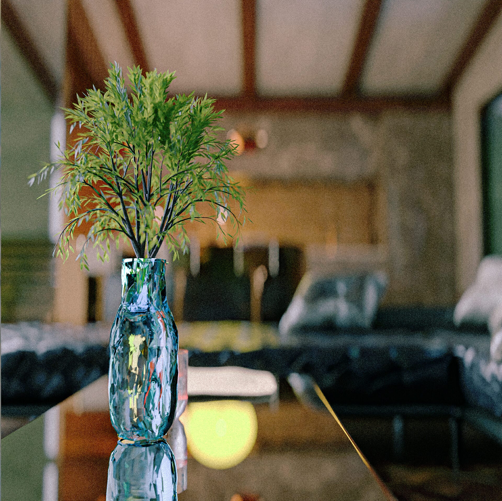
I’m always inspired from nature and from how to world is so random yet in an organized way . so within each organized space i try to add an element of surprise and realness , an element that makes the space more humane . you can find this by a very random element or a misplaced item , or some open window that the owner forgot to close before clicking the pictures .
people relate to this project more as a familiar home , it’s not a very far away home , you can find it easily here and there , also it doesn’t feel too new or too old , maybe the classic touch gives it the timeless aspect which everyone can relate and love to look at .
for more details you can check the project here :
https://www.behance.net/gallery/164180569/Interior-Space-you-are-so-Golden
- Architect: TibaAli
- Other: https://www.behance.net/gallery/164180569/Interior-Space-you-are-so-Golden


