In this living room we have combined the curved lines used in the classic and the straight ones, which are mostly in the styles with minimal, modern accents. Minimal accessibility and lack of opulent ornaments create a space with an image of a breathable yet sophisticated area.
The House of the family N. situated on the shore of the sea, in the town of Navodari, has on the ground floor a garage, a bathroom, a kitchen, terrace, but also the subject of our Article, the living room, the staircase and the entrance hall.
The heart of a dwelling can be depicted in the living room. Here the whole family gather to spend the most precious moments of joy. It’s the place to gather daily for socialization, relaxation and fun. The design of such a room requires us to pay close attention to aspects such as the shape and size of the room, the style of interior design used in the rest of the house and the personality of those who use it.
In the room we will detail we used a mixed style in which we combined the curved lines used in the classic and the straight ones, existing predominantly in the styles with minimal, modern accents. With minimal accessories and no opulent ornaments we have achieved a space that enjoys the image of a well-ventilated yet sophisticated area.
Furniture, Lights and Décor in the Entry Hallway Area
The House of the family N. situated on the shore of the sea, in the town of Navodari, has on the ground floor a garage, a bathroom, a kitchen, terrace, but also the subject of our Article, the living room, the staircase and the entrance hall.
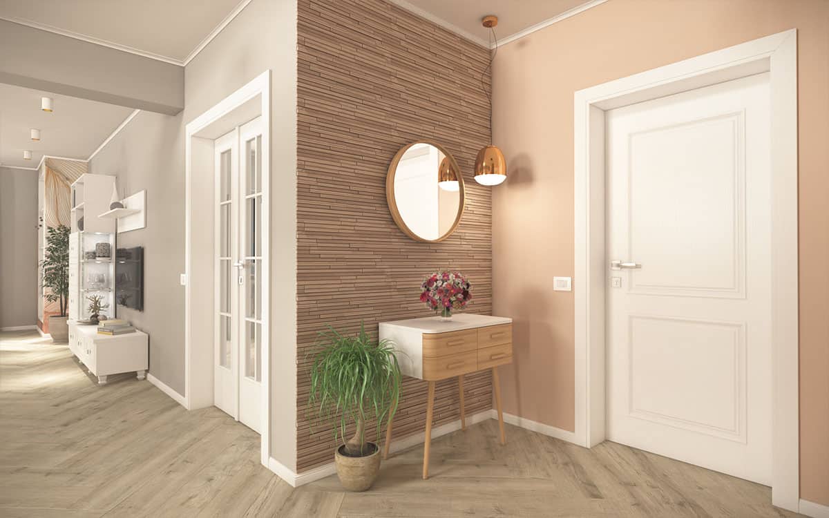
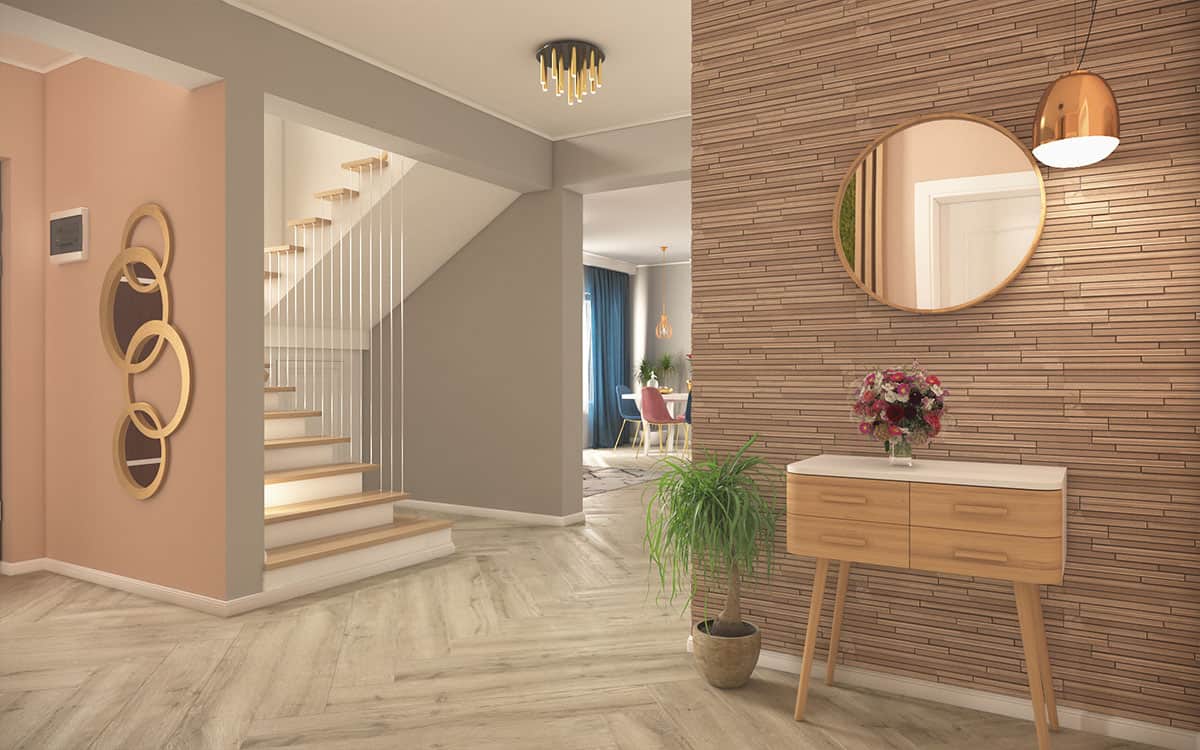
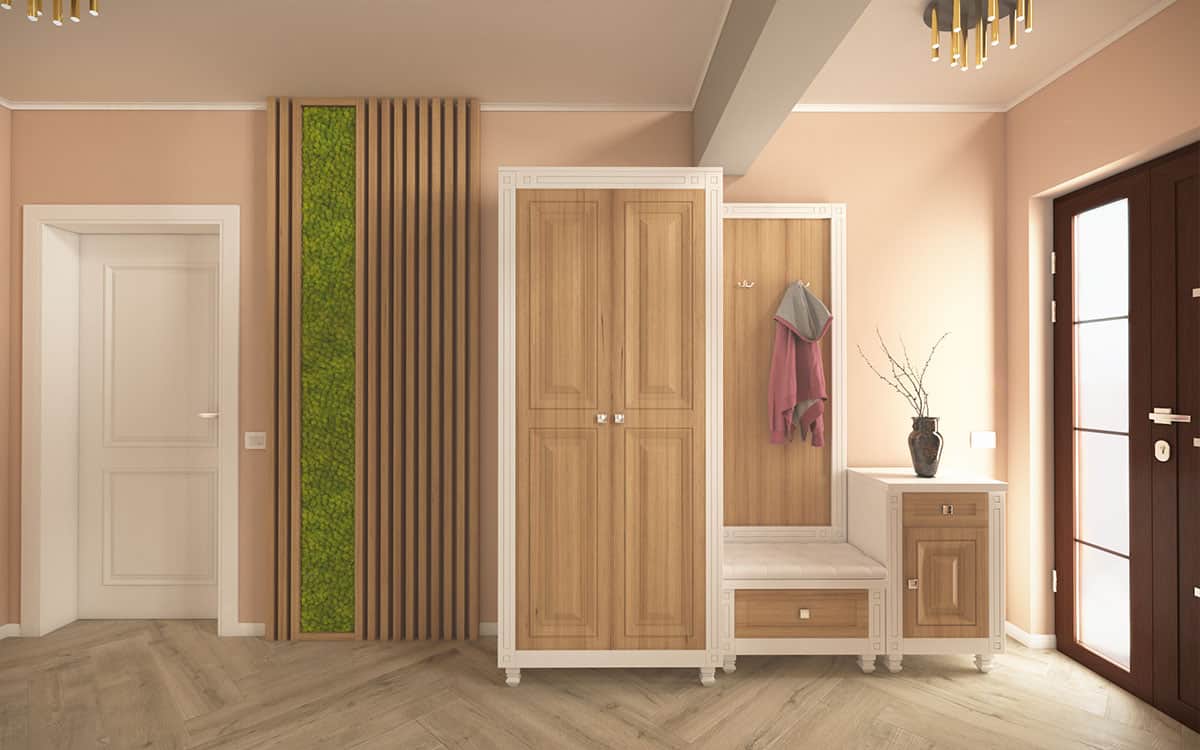
From the very first steps inside the house, the mix of styles can be identified. The combination of classic elements of the custom-built furniture (white blade, trimmed MDF fronts neighborhood, leashes greek, feet FB-17) and the Espherical 1 ORO decorative mirror with the most modern ones such as the Heidy console or the Hubsch Frio round mirror reveals the intention of achieving a balanced atmosphere.
The construction of a decorative area of natural elements such as wood and stabilized lichens comes as an addition to the color diversification of the area. With this panel we managed to break the prevailing trend of warm colors and put the light and cool green of nature into the landscape.
Over the past years the role of lighting has changed. From simple elements of necessity they have become real pieces of strength in the interior design of a house. We decided to be consistent in the use of materials and chose luminaires with metallic finishes, gold, the 9054 Nowodvorski-pillar lights and the elegant Redo Pound 01-1074 pendulum in the console area, and added pleasantly to the living table and the seat legs.
The achievement of a soft, warm feeling is dependant on the way in which the predominant surfaces in the room are treated. We chose for the walls of the entrance hall a warm shade from the Tamboour Paints – Harvest OAT 0401P, color that transitions to the gray of the ceramic living room Frax Muretto from the Sands experience collection of Italgraniti Italians.
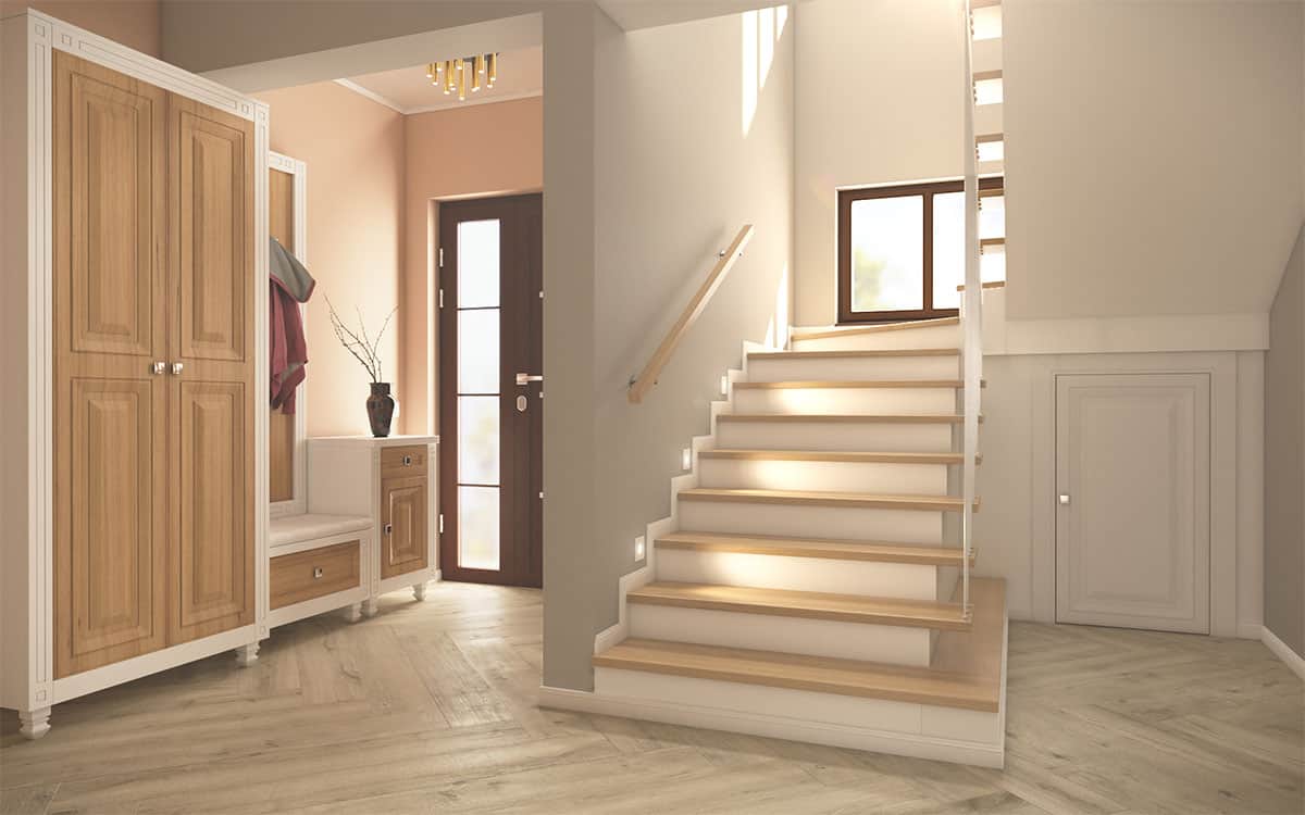
The white doors leading to the bathroom and garage are products of the Porta doors, vector V model The area under the platform of access steps to the mansard required the construction of a slightly more special type of furniture from the milling MDF. It was designed to close the area both esthetically and to create a small space where the heating distributor is positioned in the floor and other small offcuts.
Finishing of Interior Stairs
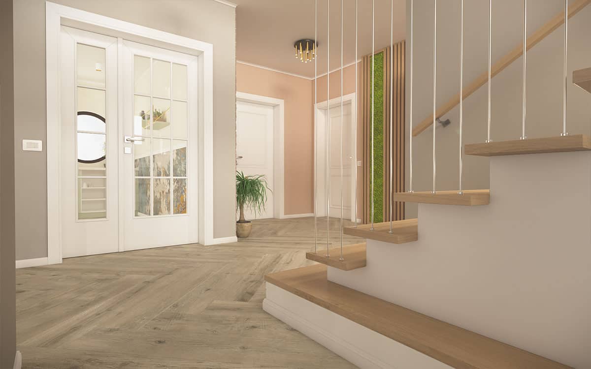
Climbing the stairs to the mansard area I kept the same warm environment using wood in both the steps and the handrail of my current hand. We decided to visually extend the first step so we can achieve a stylish closed policy area where flowers or other decorative elements can be stored.
In the ladder eye (that space between the two segments of the ladder) we extended and tied the lower steps to the upper steps using thin chrome bars. They are primarily intended to visually delimit the step area and to achieve a special esthetic appearance.
Positioning of Furniture and Decorations in the Living-Room
Most of us, regardless of the space available in a living room, are tempted to position the furniture according to one thing, the TV. While turning the living room into a cinema room can be truly tempting, pursuing this goal does not necessarily lead to a satisfying or esthetic appearance.
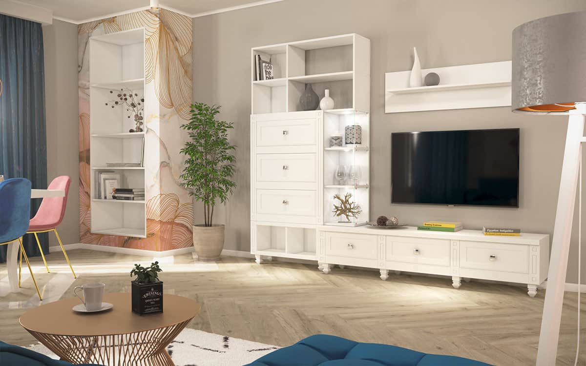
The integration of the dining area into the living room and the maintenance of the mixed style we have approached from the beginning led to the positioning of an extensible Mozart beech wood table together 6 elegant EM Bloomingville chairs near the windows. We have thus obtained plenty of daylight dining space and as artificial lights we used ourselves on the sides of the two Ampolla 2 SP1 and the Redo sound 01-1075.
The furniture building in the living room was carried out according to the same specifications as in the entrance hall. Made entirely white, the furniture is positioned in a timid contrast with the gray of the walls and the decorative volume dressed in the 3D photo photo photo Pink Marble at RebelWalls closes in a harmonious way the longest wall of the living room.
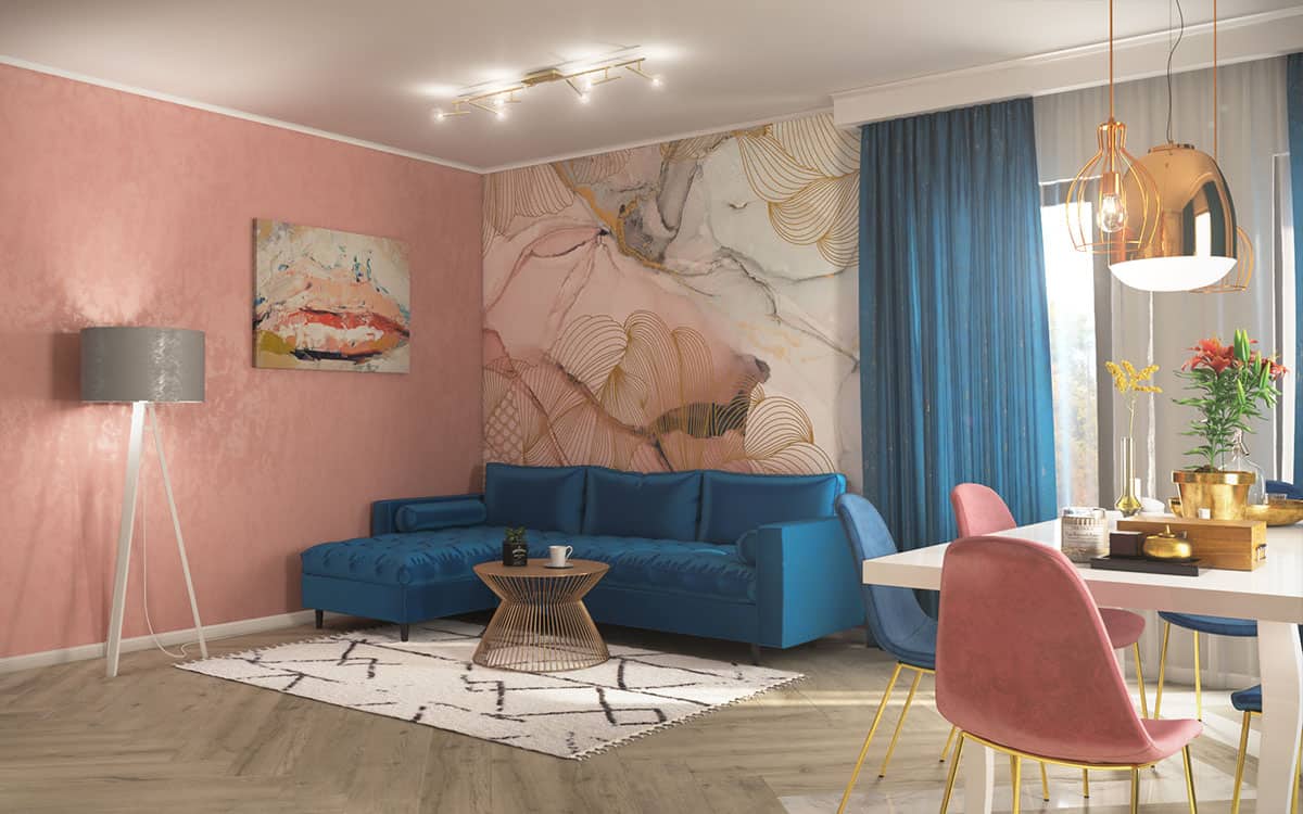
The aim of the living room is to bring us together with family and friends for social, leisure and fun sessions. How can you get a welcoming place of relaxation if not by using a comfortable sofa? To strengthen the balance of the offered facilities we used warm colors, alternating with cold shades, this is also the invicta Cozmanca Blue colt.
The color association of the texture of the coltar with the Lussuria curtains of Mendola Fabrics and the seats in the dining area contrasts the warm shades we receive from the wall with the pink decorative plinth and the RebelWalles Opulence Pink Marble. The Pink Lips picture in the portfolio of Framed complements the need for an accessory that is in the same tone but still creates a subtle contrast.
The design of the Suus Black wood coffee table appears to be unclipped from the floral wallpaper and matches the metallic finish of the Maracas PL6 luminaire on top of it. The BPS Koncett Lampadar used in front of the decorative wall acts as an element against heat and highlights the main word defining this arrangement, balance.
In the room we will detail we used a mixed style in which we combined the curved lines used in the classic and the straight ones, existing predominantly in the styles with minimal, modern accents. The feedback received from people was that the project was really nice.
- Interior Designer: Case3D
- Interior Designer: Bogdan Irofte


