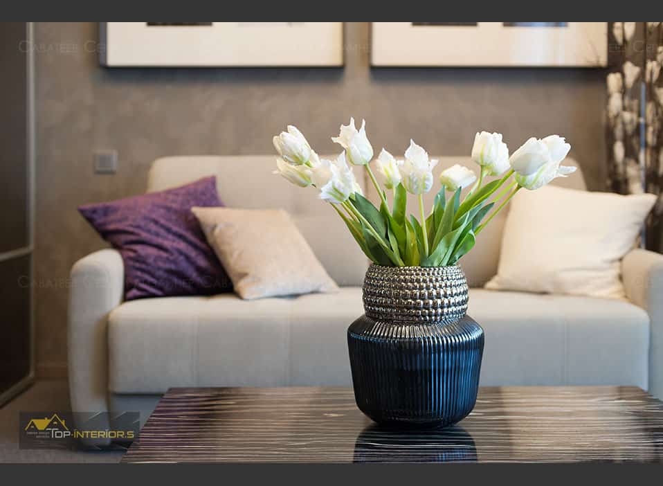
The customers did not realize what actually could be done with this space. Nevertheless, one thing was evident – 34 square meters could accommodate the required minimum for a living, and maybe for a couple of guests. This space without inner walls was designed for permanent residence of one person.
The customers did not realize what actually could be done with this space. Nevertheless, one thing was evident – 34 square meters could accommodate the required minimum for a living, and maybe for a couple of guests. This space without inner walls was designed for permanent residence of one person.
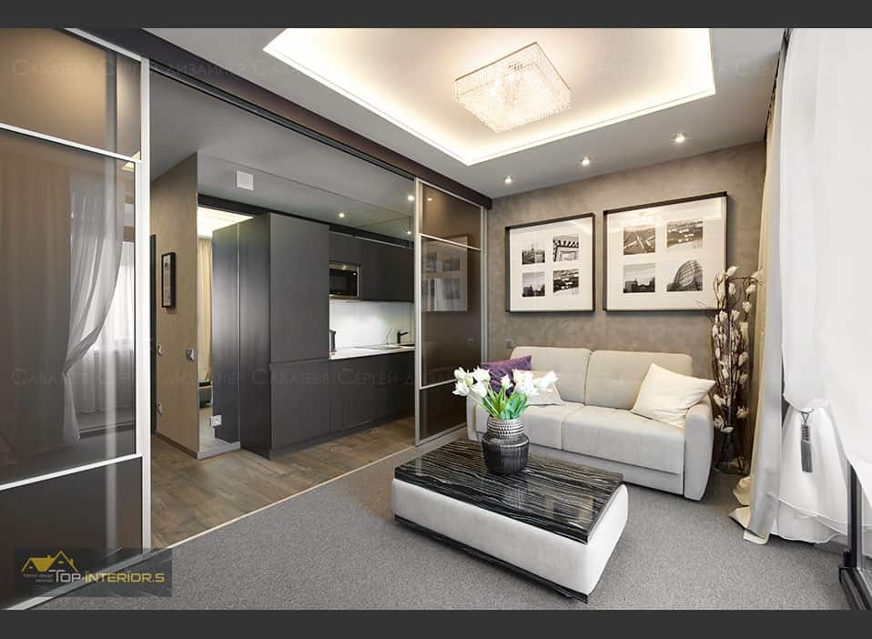
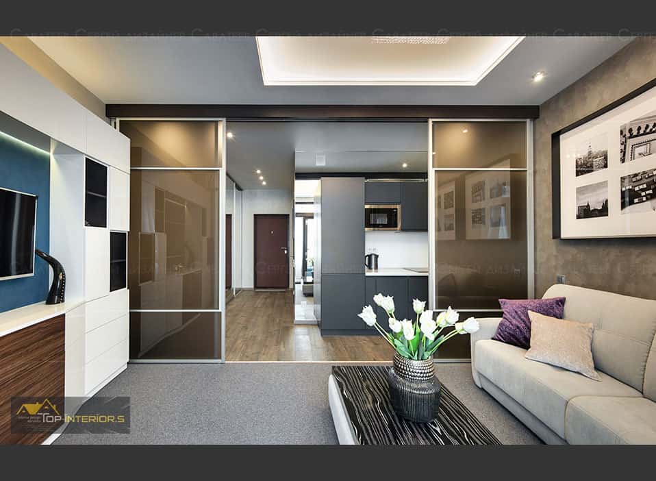
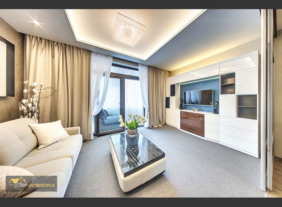
The Studio is one rectangular room with an isolated bathroom and a loggia. The living room, which also serves as a bedroom, is located between kitchen area and the loggia. The loggia was enlarged by dismantling superfluous facade insulation and widening passage into the room. We cut off all unnecessary layers of the walls and removed under sill fragments of the walls to install sliding windows from floor to ceiling. The facade was insulated and double glazed windows were installed, we also made underfloor heating and insulated the ceiling. Sergey Savateev says that he wanted to make the place as much comfortable and practical as it was possible working with such a small space.
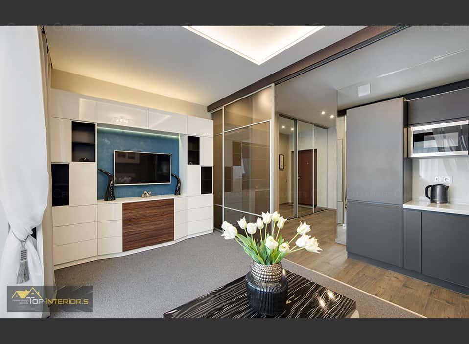
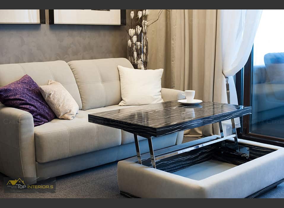
“The color scheme I used is complex, in terms of combination of a large number of shades – brownish-grey, golden beige, grey, white and blue! All were adjusted to each other. For example, when we painted the walls with our test paint I realized that the client would not approve of this color if he saw it, as it looked something like khaki color, swamp color and without overall context, this was rather risky and bold. Now, when the decoration is finished it does not stand out and supports the overall tone.
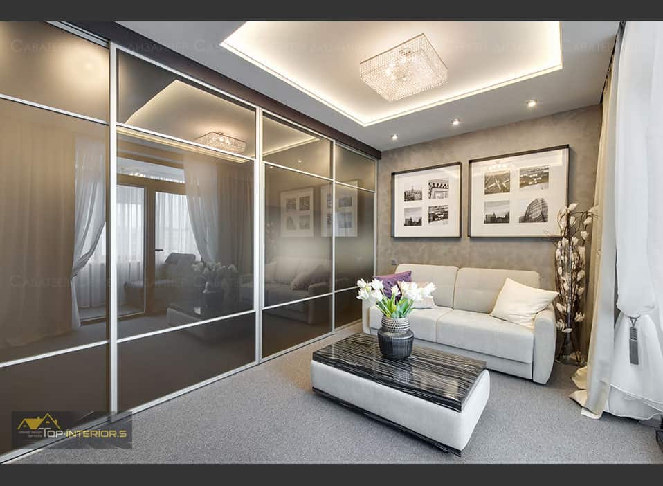
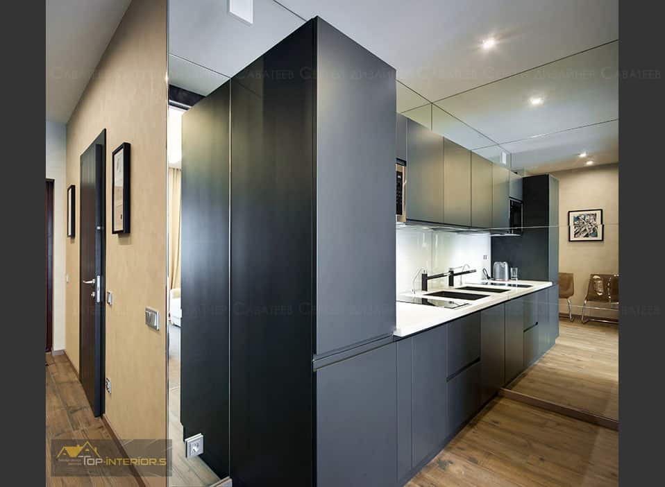
The studio has many mirrors – they became kind of signature thing here. They hide space limitations and visually make the space twice larger. The hall seems to be wide and spacious, along the kitchen there seems to be a passage to the next room, which is actually a visual effect. Still, the mirrors are located so, that the person does see his or her reflection all the time, they are in passage areas, so you need to come up to the mirror to see your face as they are here not for “self admiration” but for miraculous feeling of space.
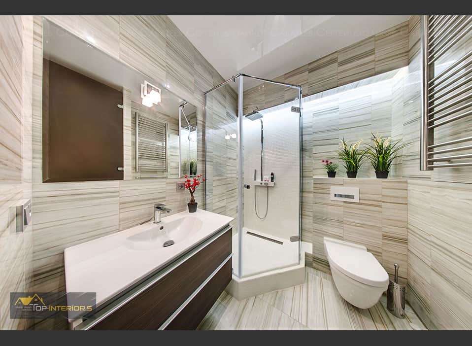
I always pay special attention to lighting and, of course, I did not miss the opportunity to create a full lightning system with no dark corners especially in a small space with few light shades. Additional lighting in the bathroom has become almost the main lighting.
The dining area is standard – one table 70×80 and two chairs; it is located next to the kitchen.
The studio is zoned in various ways: a large mirrored wardrobe doubles the area of the entrance hall; a mirror in the kitchen extends the space twice; the loggia is separated by only a floor-to-ceiling window, half of which is always open, and is perceived as part of the bedroom, and textiles of the loggia enhance this effect.
Bathroom tiles form basis of the shower. The shower has a glass door. Washing machine and bathroom accessories are hidden behind a toned matt glass door. Toned non-transparent glass walls create kitchen, living-room-bedroom, and loggia zones in the studio. I wanted to create maximum comfort and make this small interior practical. I managed to implement my ideas in the project using mirrors and glass walls.
I called this project “Oasis”: such a small apartment, and there is everything needed for a good living there, moreover, sandy and brownish colors dominate in the color scheme – such a small cozy space in the “desert of the city.”
- Interior Designer: Sergei Savateev (Top-Interiors.ru)
- Photographer: Konstantin Nikiforov (812studio.ru)


