The bedroom is the space where you regenerate your energy after a tiring day, the place where you relax by reading a book or the corner where you retire to gain privacy. The matrimonial bedroom is not any bedroom, but it must emane comfort, be grandios, luxurious and get drunk to relaxation.
If this bedroom is part of an apartment then most likely it falls between 10 and 20 meters in the same area. Obtaining an arrangement incorporating the above in such a space can be difficult enough to obtain. With an intelligent, functional compartmentalization and an attitude that makes the word “difficult” “challenging” any space can achieve its intended purpose.
The matrimonial bedroom we will detail in this presentation is part of such an apartment, has an area of about 15 square meters and for an extra difficulty (which we all time convert into challenge) it has 3 doors of transit to the lobby, terrace and dressing.
The predominant design style
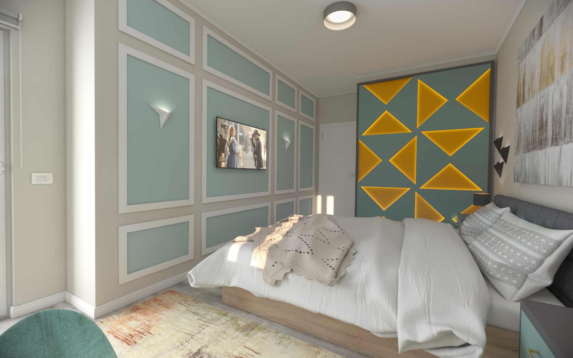
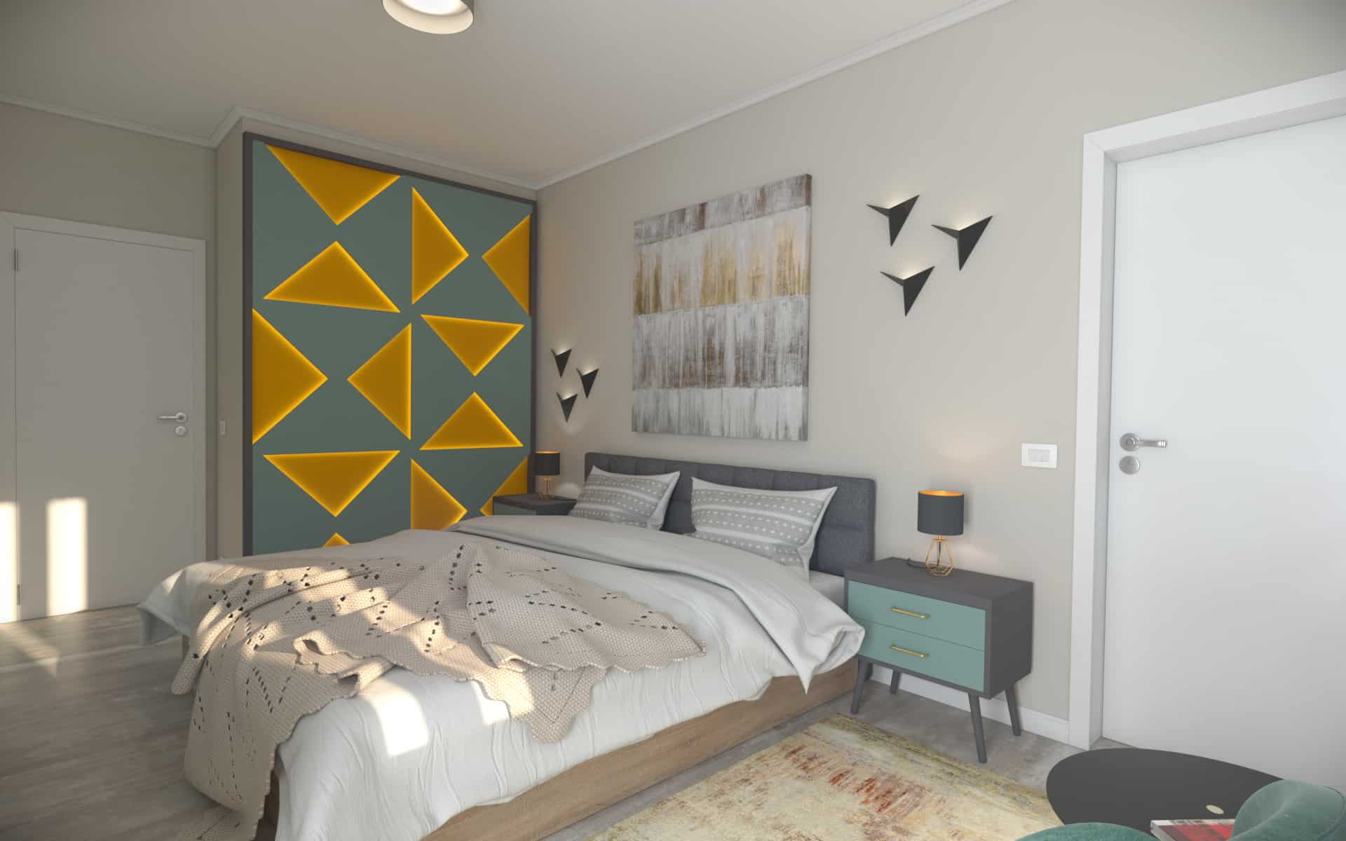
We chose to lean toward contemporary style so we kept a simple, clean, minimal, design based on geometric shapes, predominant being the triangular lines we find in several elements of the arrangement but especially in the decorative panel that wraps the wall adjacent to the bed.
It is known that bed must be the central element of a bedroom, but we, as the competitiveness followers, have chosen to use multiple items that can covetate together on the dais. Going on this principle we inspired the Philadelphia curtain model and proposed a decorative panel made from a sheet of MDF coated and painted with a Pantone 5497 C color
On the back of this MDF, LED strip profiles have been applied so that the light slot generated reflects a warm and comfortable halo when it hits the PAL plate on the back of the panel that has a Sorbet Orange U340 ST9 finish, finishing that meets in a pleasant way with the rest of the natural wood decorations. It was then framed by a border made of double PAL (36mm) for which we stopped in a gray U9631 ST9 diamond finish.
Choosing wall finishes
The existence of 3 doors in the matrimonial bedroom makes wall finishing an easy job. We opted for painting them in the make sense 1583P color of the Tamboour Paints color, which takes us with the thought of sand, beach and holiday season.
The need for a TV in the bedroom is something that cannot be ignored nowadays so we have been put in a situation where we can find a solution for its positioning in the given space. As the most comfortable place in a bedroom is the bed we decided that the TV should be suspended on the wall in front of it, a convenience not being a solution due to the lack of room for movement between the bed and the wall.
For an extra esthetic refinement we dared to introduce new forms into the equation. We used the Elegance decoration – B5 profiles to create rectangular borders, borders that fit a new color. The pure Aqua 0919P brings us exactly what we lacked, the feeling of clear water like the Mediterranean turf perfectly filling the picture of a pleasant summer scene.
Just as a shirt should not be worn in a pant without a belt, no floor should be left without a plinth. We went on the same product as in the rest of the arrangement, the decorative plinth of rigid polymer S8 and for the join between the roof and the walls we chose the decorative cornet of rigid polymer C9.
Flooring Option
In terms of heating the apartment uses a floor heating system. As from the experience the most effective finishing of the floor in such a system is ceramic, we chose to use stoneware made in Italy, from the manufacturer Del Conca, the Vignoni collection, the Taupe model, dimensions 1200x200mm.
The interlacing between the plates must be done according to the recommendations given by each of the manufacturers, but as a general term if the chamfer is made on areas greater than 300 mm, which may create “dished” areas because the plates with significant lengths tend to become inconsistent. Their woven mounting on smaller areas (150-300 mm) visually attenuates this problem. We opted for a mounting consisting of a gap of 150 mm on each plate, then a return of 300 mm.
Choice of furniture
Generally, the destination of a space is given by the existing utilities in it and by the furniture parts which consist of the arrangement. If we talk about a bedroom, it is obvious that we can miss anything but bed in the room. This is the king of the chess board when it comes to the arrangement of the rest space.
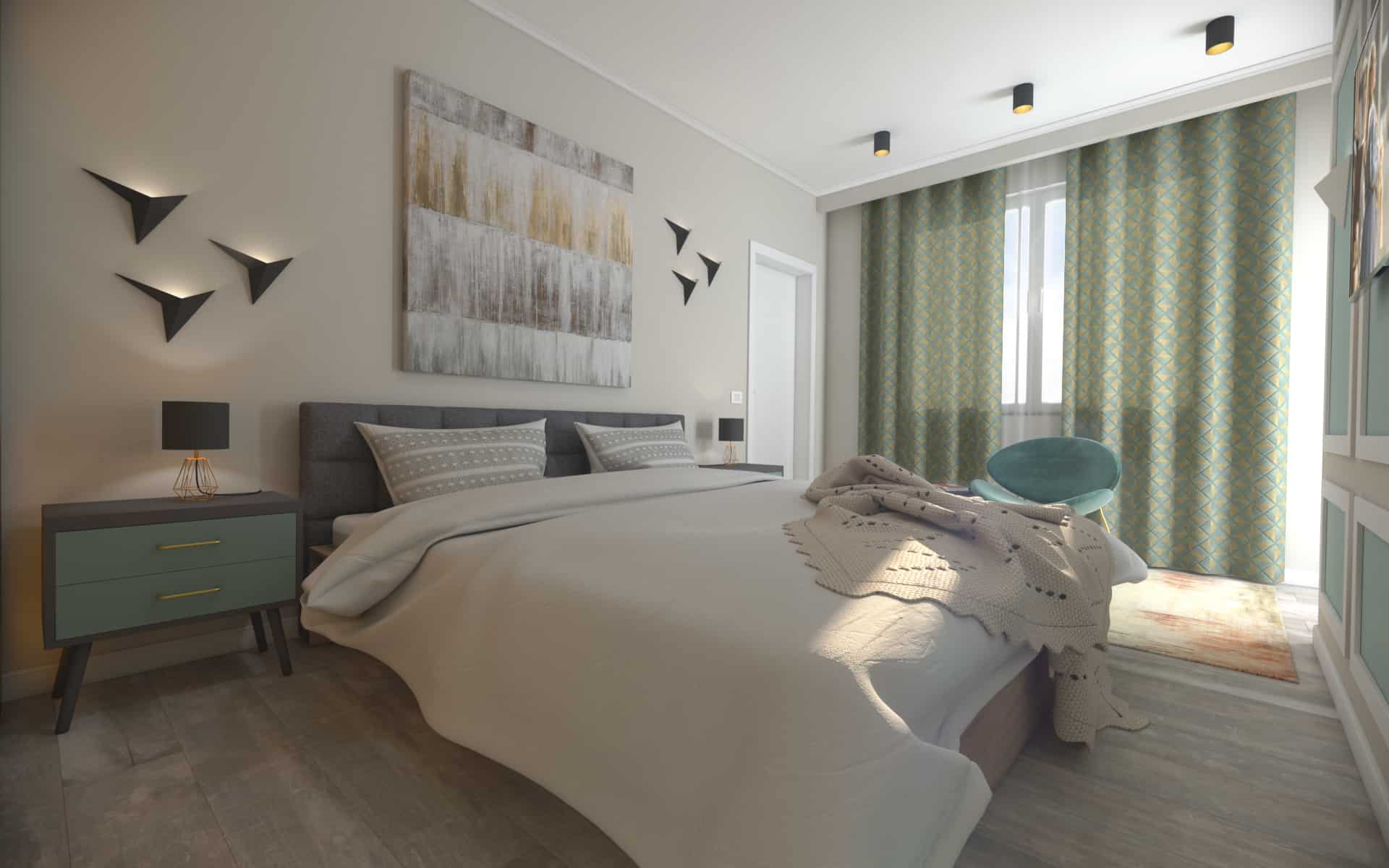
In the case of a matrimonial bedroom, the bed must be positioned in the center of the room. We chose a bed with a 180 cm Mexico mattress, which is built from a PAL with Sonoma oak finish and which can optionally benefit from a storage drawer. At the top there is a padded, textile top that shows a more elegant touch and perfectly matches the two noptiere that outflank it.
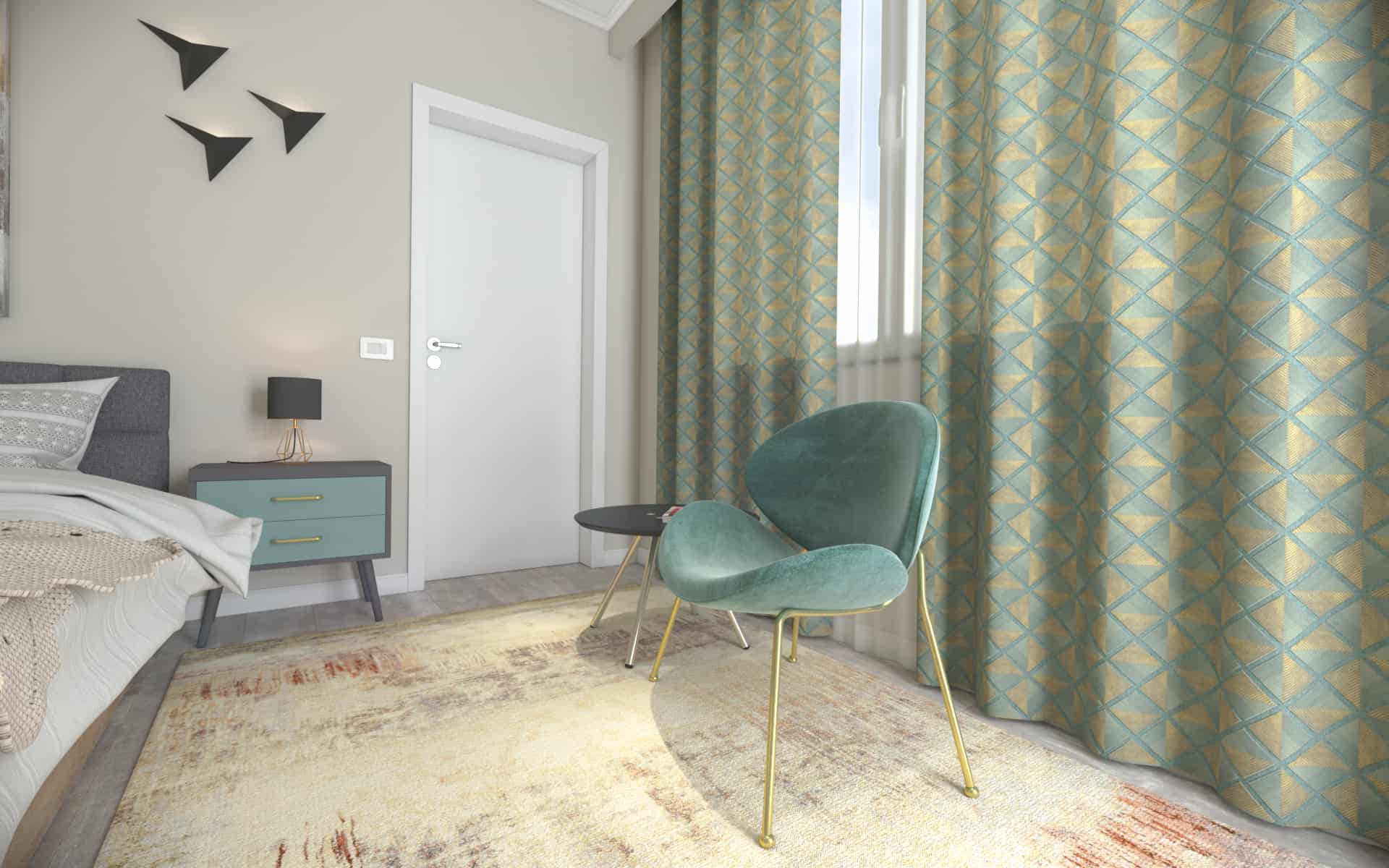
The night stands we introduced in our arrangement are custom made using gray PAL diamond U9631 ST9 and the front are of PAL Kronopspan Dusk Blue K097, the equivalent for the painted MDF in the decorative panel. We chose wooden legs but the elements I emphasized were gold metal handles, finishing that complements the coffee table and relaxation chair.
Coming to this area we opted for a Leitreason Sliced coffee table and the resisting piece both for itself and for figuratively is the armchair AT Kris whose fine velvet finish accompanied the modern drapery in diamond-shaped gold thread inserts. The perfect fabric of the curtain wraps the whole concept in precious geometric shapes that, along with the other elements of the decoration, bring a sense of familiarity, welcoming space, convenience but also a shell.
Such an arrangement that marked so much refinement could not miss a piece of art, so I used the Sawyer painting from Mobexpert, a painting that mixed the harmony between the golden and silver tones and is evidenced by its perfect elegance. The painting of this painting is done manually on a cloth placed on a frame built from wood and excels through the abstract and modern cob.
To complete the entire picture of interior design with style and comfort we dressed the floor with a Nikita carpet of which the decoration gives us the feeling of a distorted picture report in the floor, the two models resembling in an almost bizarre way.
Interior door selection
The decision regarding the doors used throughout the apartment was to be identical, simple and white from the Porta déor collection, model P of the manufacturer Porta doors, which perfectly match the type and style of the accommodation offering us a holiday air.
Choice of luminaires
Although our bedroom is surrounded by doors in almost all directions, the one on the terrace contributes with the window to the supply of warm, natural light that is so necessary for a healthy life. “Where the sun is, there is also shadow.” ; this is how an old korean proverb sounds. As the sun shines in the sky less time than we would like, every evening we find ourselves in a position where we have to substitute the services of this Heavenly luminaire by lighting up worldly luminaires.
In the layout of this bedroom we have combined multiple types of lights, both functional and decorative. Like the central light we relied on the Eglo Palomaro Dome light, whose laptos white speaker scattered light evenly and diffusely across the space. For the relax area and read I felt the need for warm but directional lights so I opted for three Eglo POLASSO 94502 spots, whose finish is subtly integrated with the table and armchair.
For the night lights we have placed a Eglo Carlton 2 – 95787 lamp meticulously on each bedside table, and for added elegance and refinement we have posted a coating of application on both sides of the picture using the frame lights, These light steps made by Maytoni. The same luminaires were used on the wall with the TV, this time they are white in color so that we get a uniformity with the frame built from the profiles.
The main role in decorative lighting is the bright panel on the right side of the bed, providing indirect light generated by the LED bands located on the back of the tramp panel.
- Owner: Altweb.ro
- Interior Designer: Case3d.ro
- Interior Designer: Bogdan Irofte


