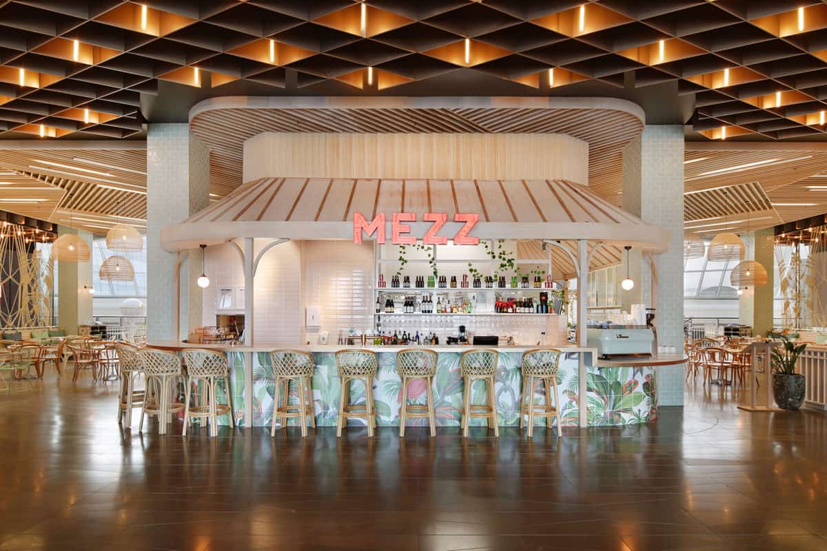
In the heart of busy Chadstone Shopping Centre a botanical oasis rises from the bustling crowds to beckon passersby into its restful and leafy interior. MEZZ Kitchen and Bar may indeed appear like a mirage to the tired shopper with its elegant finishes, lush planting, garden motifs and chalky timbers.
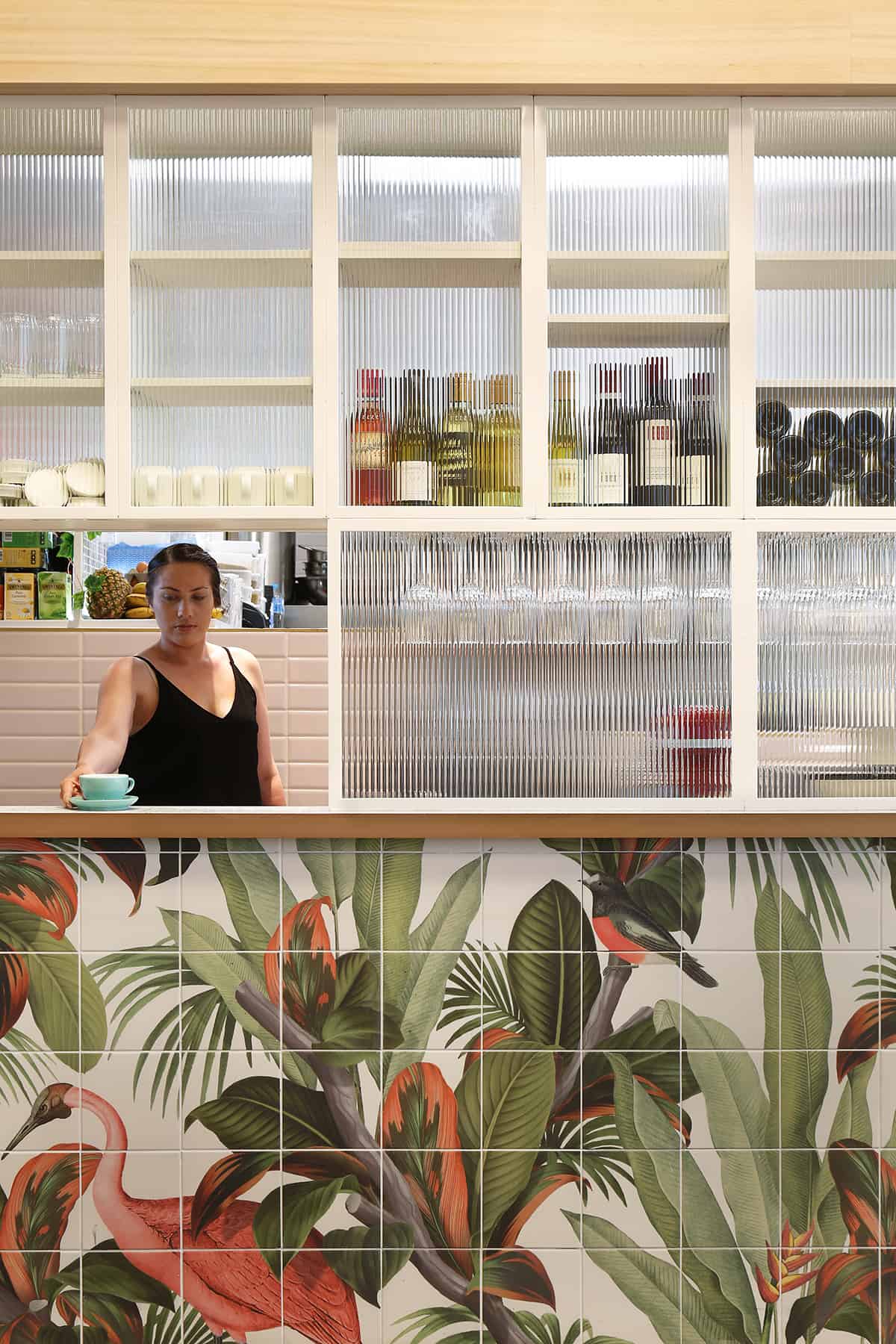
Studio Y designed the space to be botanical and calming, high-end yet humble, and a reflection of MEZZ’s healthy and light cuisine. While enjoying the delectable fare on offer, patrons take in an almost 360 view of the produce being prepared inside. The front of the gazebo is cladded with stunning jungle-inspired custom printed tiles, designed specifically for MEZZ. The space is further enhanced by the slatted ceiling, reminiscent of a tree canopy, the lighting placed carefully to seem like shards of light peeking through.
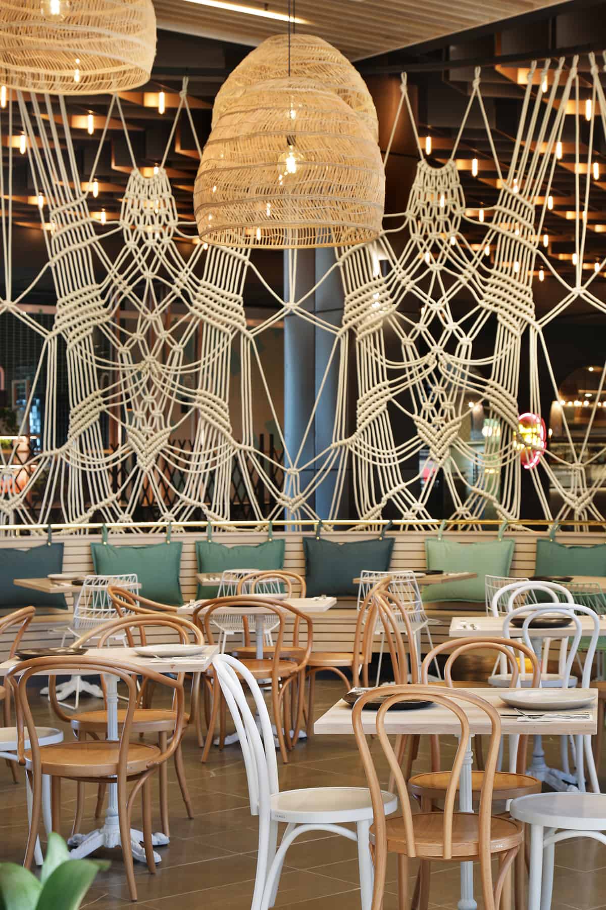
Diners can now sip on a crisp Pinot Grigio while taking in the jungle print tiles, giant macrame screen and sumptuous plant life adorning this fresh, sunlit interior.
We were challenged to create a design which was high end but also humble and inviting. It was to be open, have next to no vertical walls and feel light and effervescent. Diners in this area are discerning, healthy and appreciative of good design.
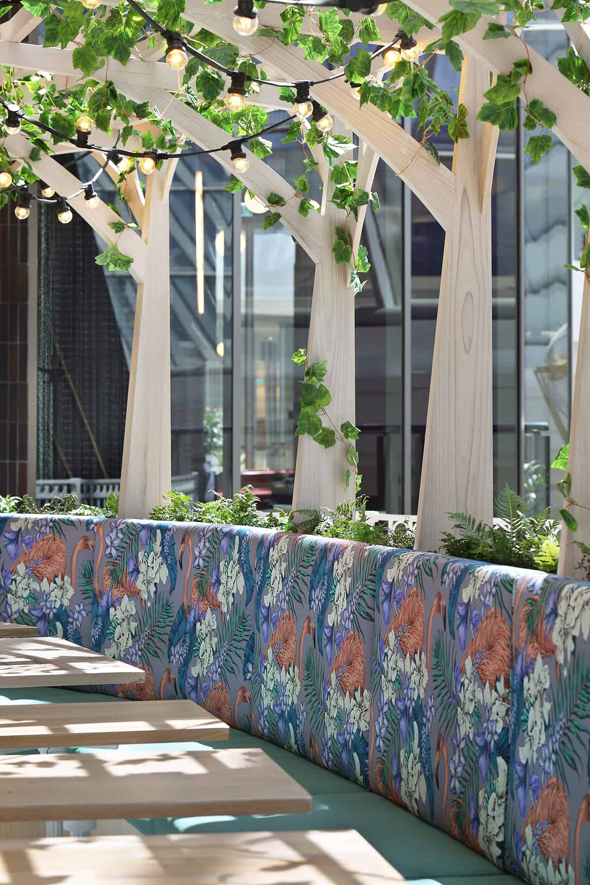
The concept of a botanical oasis was born from the natural light flooding the area and from the challenge to transpose the diner away from the hustle and bustle of the shopping centre setting and make them feel like they are walking out to a courtyard. You are then met with soft pastels of green and pink, framed in a timber gazebo cladded with custom printed tiles. Further inside are cushions in various shades of green on a back drop of soft Victorian ash. The pergola in the back loosens up the space with climbing ivy and festoon lighting to give it an outdoor feel.
People are surprised and delighted that they can now enjoy and experience a high-end restaurant within a retail environment.
We did a lot of problem-solving during this project. As it was to be open and have no vertical walls, we worked with a macrame artist to design two 12mx4.5m macrame screens which flank the restaurant, inspiring intrigue and allowing glimpses of light to spill through from inside. Probably the most prominent design challenge was us having to encompass a fully functioning kitchen in a tight allocated space. This was resolved by housing the kitchen in sort of a ‘gazebo’ but ensuring it encompassed all of the required services was also challenging. To fit in the kitchen exhaust we raked the roof structure and hid it within the centre cavity of the gazebo ‘ceiling’. We then cladded it with the soft pink tiles to ensure it was hidden and to preserve the conceptual integrity of the structure.
- Interior Designer: Yaron Kanor
- Interior Designer: Sophie Metcalfe


