The project was developed for a construction company that opened its office on the territory of a residential complex under construction.
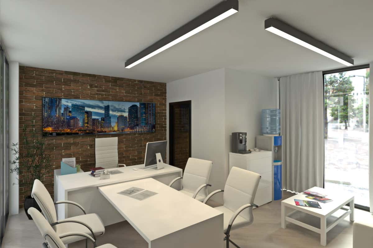
The design of the office is simple and restrained, more suited to a minimalist style. The space is divided into a working zone and a recreation zone located at the window with a view of the city landscape.
Renders are made from several points of the office quarters.
The idea and the plan was to create a comfortable and practical office, in wich workers feel comfortable at work.
The project was developed for a construction company that opened its office on the territory of a residential complex under construction.
Office furniture is adopted from the IKEA series. The color scheme is adopted on the basis of the technical specifications made by the customer, which corresponds to the signature colors of the construction company. The simplicity of the forms, combined with the color spectrum, gives a feeling of comfort, which encourages the employees of the company to engage in a higher level of performance in their professional activities.
The design of the office is simple and restrained, more suited to a minimalist style. The use of IKEA furniture is always a modern design, variations of shapes, textures and colors, and pursued the goal of saving money on the construction of this office. The space is divided into a working zone and a recreation zone located at the window with a view of the city landscape.
Of course, from the sites: Pinterest and Behance, Scandinavian accents in the interior were borrowed. Renders are made from several points of the office quarters.
When visualizing the interior, both ready-made textures and newly created ones were used. Also, the use of HDRI maps when rendering the images, becomes more realistic. The interior is exposed without treatment in Photoshop. I think when creating modern interiors, it makes no sense to use all the advanced means of expression and “cool” tricks. It is enough to achieve a feeling of comfort, more air, a symbiosis of interior-exterior and the “absence” of the interior itself.
The client was satisfied with our work. We gained some experience in interior modeling.Also we learned a lot of things from this project, but most important is that beauty and comfort lies in simplicity. Of course, people would ask: why there is no any people in our visualisation? The answer is simple – everyone want’s to see himself in beautiful space, so why would we disturb the viewer with strangers in the space?
- Architecture & Design: ArchDeVS


