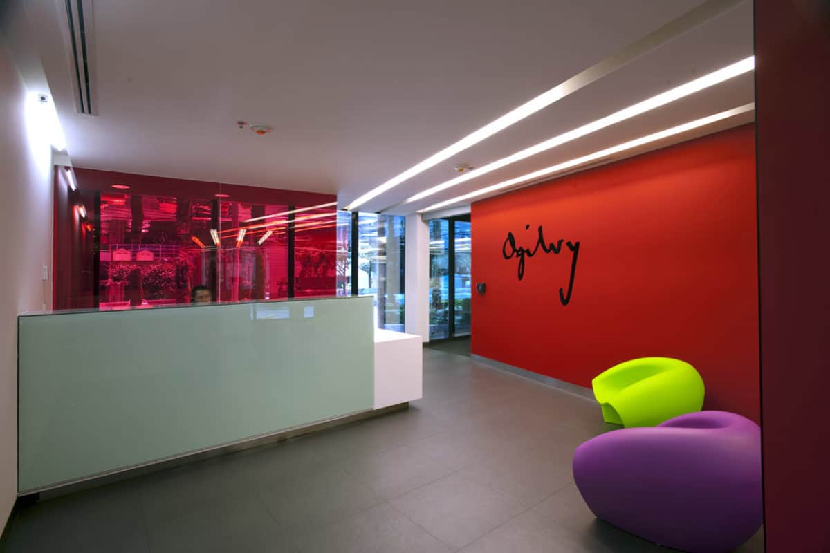
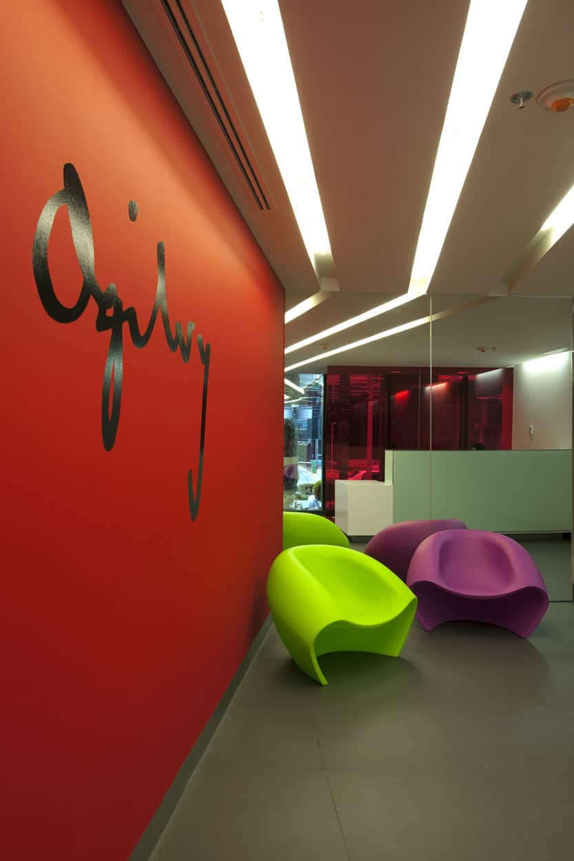
The new offices, of one of the most awarded advertisement agencies in the world, resemble a gear in perfect synchrony. Circular, square and rectangle geometries give shape to the layout and the different areas are interconnected according to the necessary space that has to be between each other to make the collaborative processes more efficient, just like the neuronal relationship of this creative brain with the most spectacular clients — brands and advertisers— with worldwide presence.
Open work stations displayed in a circular shape with a kernel for meetings or immediate encounters of “creative kick about”. Glass boxes meeting rooms or telephone booths and a glass amphitheater for campaign presentations, are part of the spaces that solve the interior needs for the new offices at their headquarters in Mexico City.
The proposal for the new image of Ogilvy was taking the essence of the space by leaving apparent columns and grades and using a cellular system plafond, which solves the acoustic and lighting problems, combined with the distribution of the exposed system installation.
The central area is organized by the vertical circulation, reception and a large main room becomes the center of the whole floor at Level 5, receiving more than 200 people, providing the ability to deliver mass messages to the “Ogilvy community.”
The two irregular ends will be spaces for private offices and services. Meeting rooms, located on level 5 and 1, have a combination of walls covered with technology Magline Wall Talker or painting boards to facilitate adherence of the campaigns presentation boards, writing and conceptual sketches.
The recycling of existing materials and furniture gave the conceptual stroke for the re-distribution, outlining the composition axis according to the concept or generator idea of the interaction between the departments of the agency to promote teamwork, information transfer and efficiency.
- Interior Designer: BIOMAH / Work+
- Photographer: ©Jaime Navarro y Pedro Hiriart


Beautiful workspace!