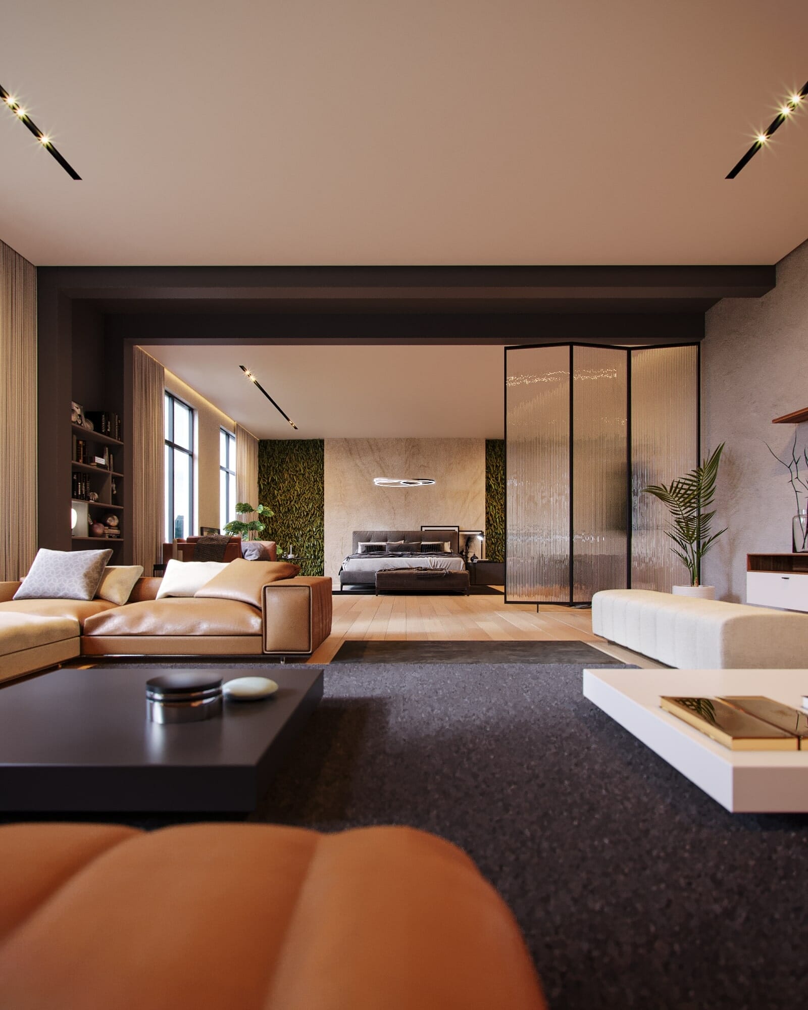
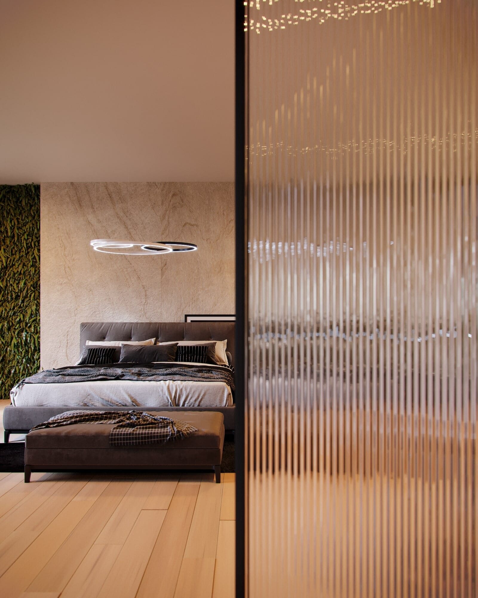
This personal project is a remake of an old scene I made at the start of 2021, mainly made to analyze my personal improvement since I started doing archviz renders back in february and to put to the test everything I learned since then.
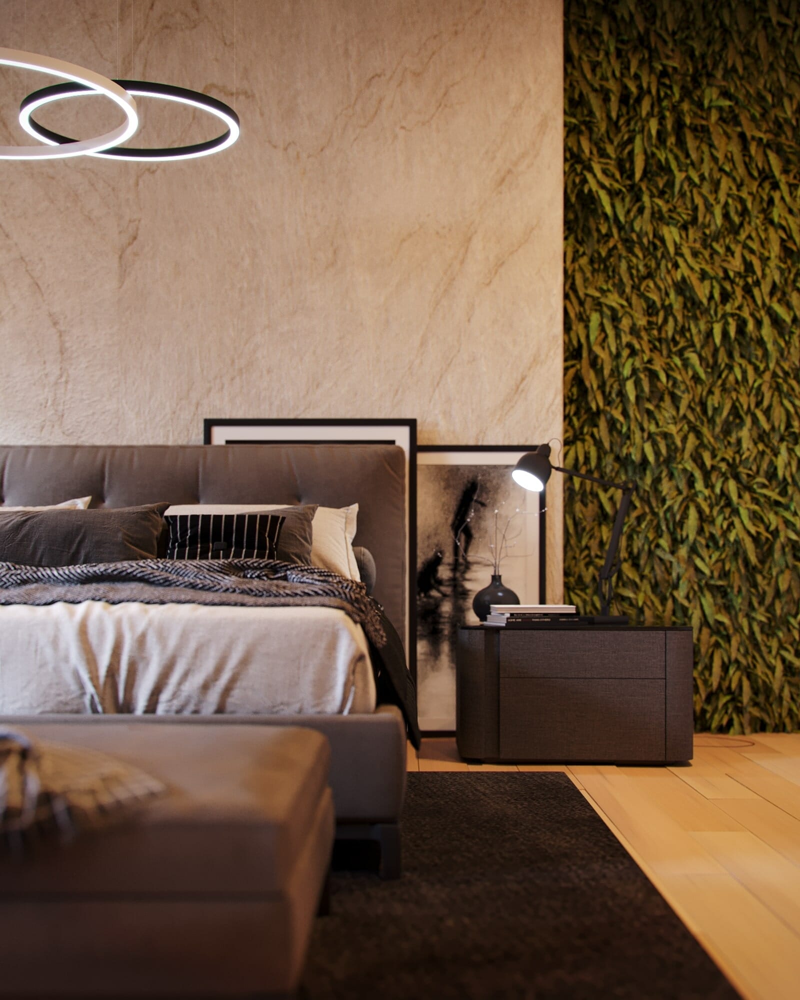
The bedroom’s design was based on a simple bedroom scene made by Ander Alencar, used exclusively to show different internal illumination techniques inside the software.
Visualization by: Davi Santos
(Instagram: @santostudio.archviz)
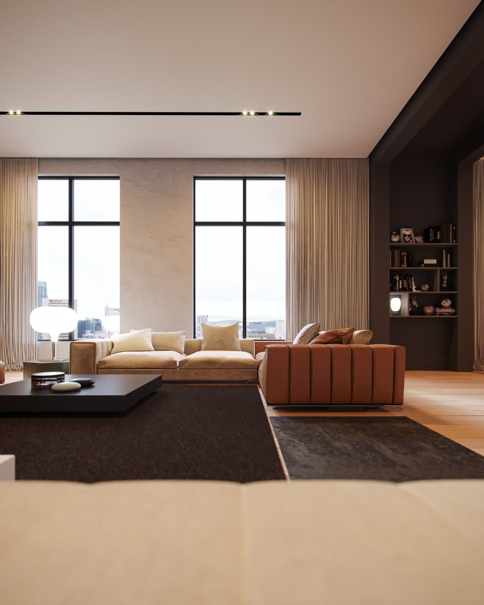
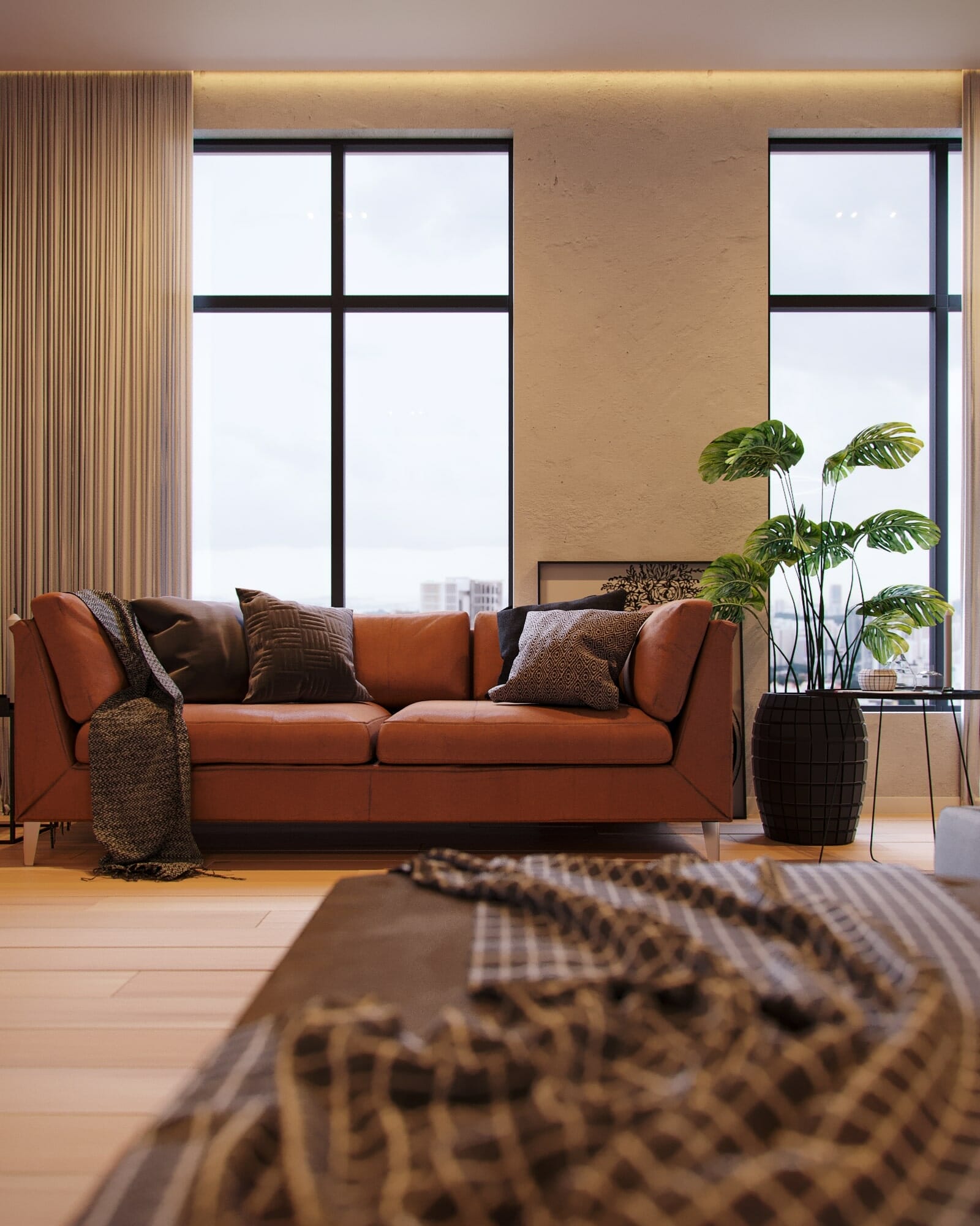
The plan for this scene was to make an cozy, realistic render using a very simple space, and to use mostly it’s furniture and surroundings to give life to the space. The furniture choice was very important for this scene because the goal was to make like someone actually lived there, so used leather and a messy bed were a must.
Another part of the images that bring up the liveliness of the room is it’s potted plants and the vegetation on the wall, bringing up a bit of nature in a somewhat cold environment.
The “bedroom – living room” setting was inspired by an old house I lived in back in 2018 which had an wooden room with a simillar format. What I wanted to do was to get the same idea but visualize it as a very modern, high-standard apartment.
The original idea was to illuminate the enviroment using a very sunny setting but after taking a look on other internal visualizations by different studios I ultimately ended up using a very diffuse, white, overcast setting which was very useful to bring up the details of the furniture and materials.
One other thing that I had to keep in mind is that this is a portifolio project, so the images needed both to look good and to be comercial. So they had to be appealing for someone wanting to buy or rent and apartment or some furniture. A balanced room illumination help a lot with that, even though it’s daytime, the ceiling lights are turned on and used with the environment light to create a warmer feel to the scene, bringing up a warm tone to the cold environment without being excessive and occluding it.
I had the idea to make this scene like it was up in a very tall building with a city on the backround back on the 1st iteration of this scene but I didn’t have the knowledge and the resources to do so back then so I reused that idea on this project.
Even though this scene is quite simple, everything needs to be balanced and fine tuned and to get a realistic scene, this means, good models and materials, carefully configurated to bring out the most in them and to fit into the setting I wanted to create. Also real camera effects like vignette, chromatic aberration, lenses length, depth of field and different exposures levels on the outside and on the inside are some of the things I allways try to do in every project because it brings out a lot for the realism and composition of the scene
- 3D Artist, Visualization: Davi Santos


