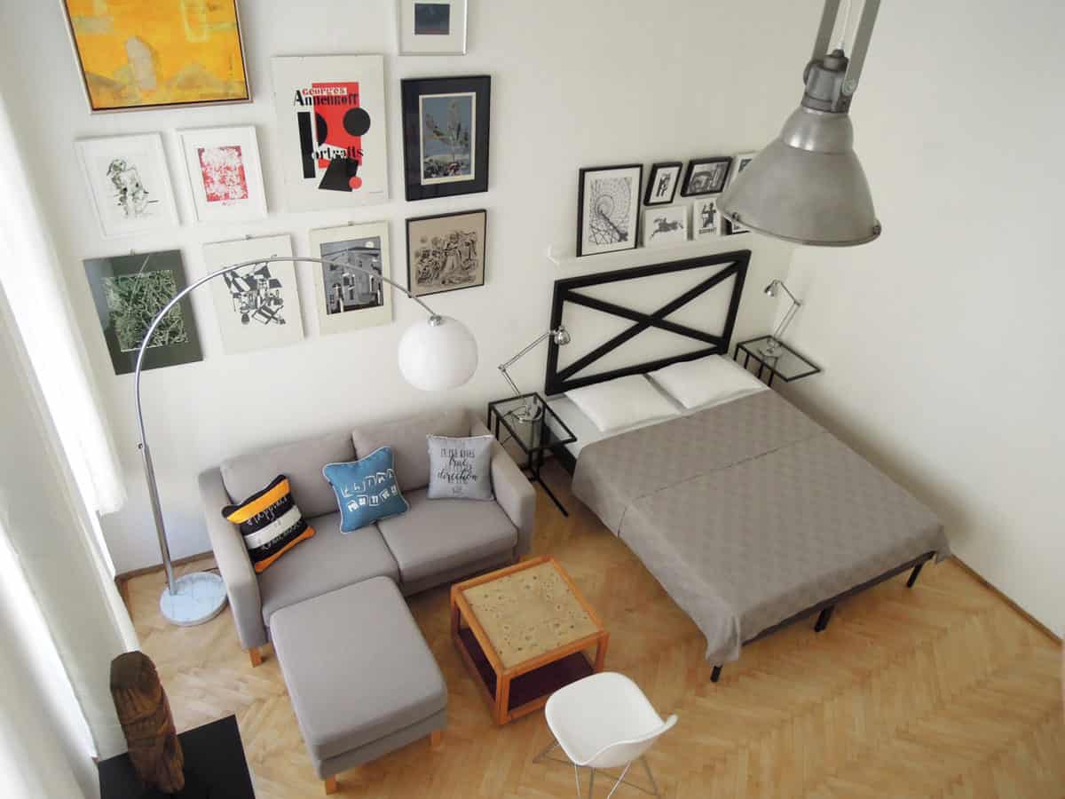
Designing a small apartment is always an interesting task and a great challenge, because it has to be spectacular and functional at the same time. In this apartment we designed a gallery wall, which is a recurring theme in our works.
This studio apartment was designed for long term rent for foreigners studying and working in Budapest. It is located near the city center, in a district where there are a lot of universities. The typical houses in this area are classical high ceiling buildings with inner courtyards, built on the turn of the 19th century, at that time representing high quality, but many of them needs renovation. In the last few years this area has undergone an intensive developement, there are many property investments and renovation of the old houses and parks. The apartment size is 30m2, the aim was to design a home for 1 or 2 person, suitable for long term stay, which is comfortable, individual and compact. In spite of the small size, the high ceiling makes the apartment spacious. Emphasizing the high ceiling was an important part of the concept. The apartment is very bright, in the living room there are two big-sized double windows, the kitchen gets natural light directly from the courtyard through the glass front door and the fanlight.
The apartment has undergone a full renovation including the renovation of the technical building system and the electricity system. We put new tiles on the kitchen and the bathroom floor, but we kept the hardwood parquet in the room, which was polished and got a new lacquer layer. We wanted to keep the old house’s character, so we preserved and renovated the big wooden windows and doors.
The requirement was to choose the furnitures and decoration to be individual and stylish, while it was very important to keep the budget low. The apartment was planned to rent out on a reasonable price, and to be competitive among the properties with the style. It was a concept to keep the walls and tiles neutral, and make the pictures and furnitures be more dominant. The most characteristic part of the apartment is the gallery wall, we have chosen pictures in different styles and techniques (oil on canvas, watercolor on paper, monotype, litograph, linocut, silkscreen). We used Stool One bar stool in the kitchen, Eames inspired chairs with metal leg, a big, old polished aluminium industrial lamp, Josef Hurka desk lamp in orange metal, carved wood statue on metal stand and cushions in the living room as characteristic elements.
- Interior Designer: Attila Gelencsér
- Interior Designer: Izabella Gelencsér


