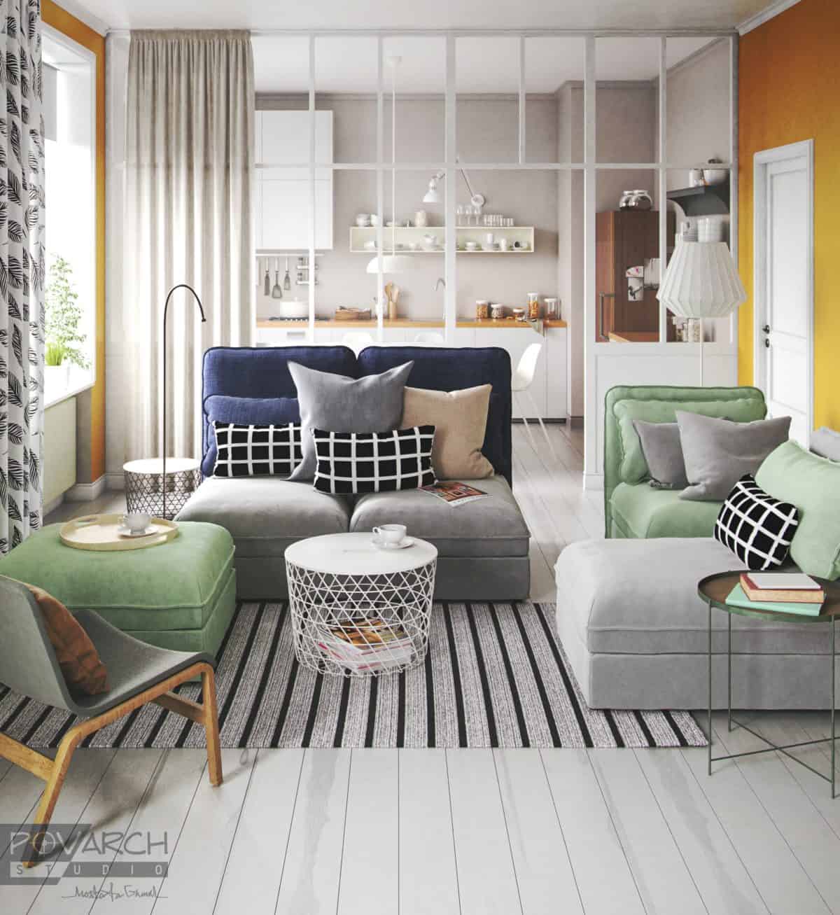
A personal project where I modeled a living room from an image reference and rendered it in different light settings. The image reference is a living room from IKEA 2018 catalog.
The rendering was created using 3Ds Max, VRay and Photoshop.
This was a personal project to practice image reference modeling and applying different light setups. The renderings were to demonstrate my skill for my own portfolio, and it’s the first rendering with Povarch Studio’s logo on it.
Recreating the scene has also given me a deeper understanding of the relation between the design elements such as furniture selection, color pallette and light setup.
I worked along the reference image from IKEA’s catalog. However; the reason why I chose that reference image was the perfect balance between the subtle warm, cold and neutral colors.
I usually place the whites or bright colors at the shorter edges of the room to square things up. But reverting this rule in this project was well done because of the visual barrier that the kitchen would’ve created.
People really loved it. A client of mine has even asked if these were renderings or photos and he’s an architect himself.
From working on this project I’ve learned that the most simple pieces can build a really interesting composition and that choosing the correct light setup really affects the scene.
- Architectural Visualizer: Mostafa Gamal


