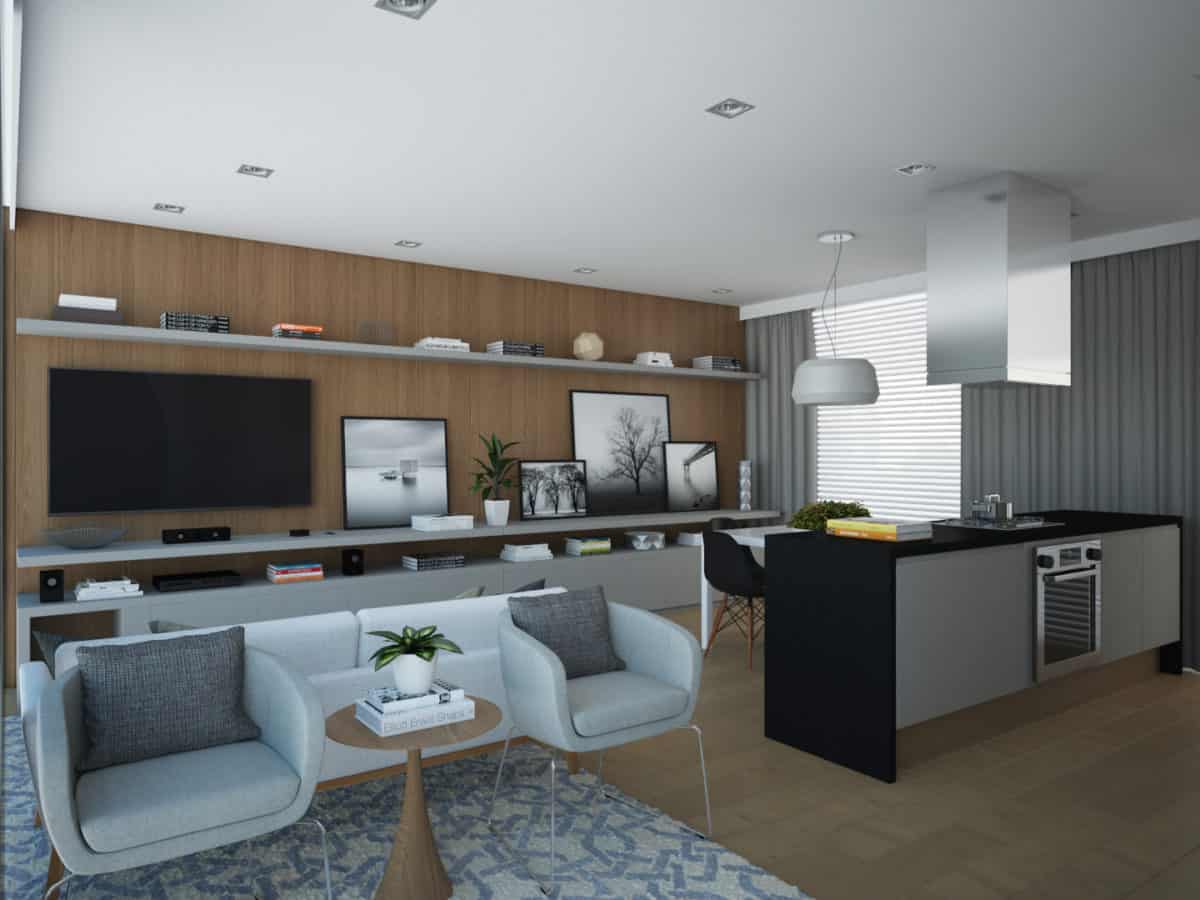
The project was developed as a study and was designed for a young couple that eventually works in the house. The spaces were designed to provide a functional and welcoming environment. The architecture of the space follow a concept of modularity and it was availed to the performance of the interior layout.
The social area, which is on the first and second module of the house, was arranged in four integrated areas, but keeps separate functions each other, are they home-living-dining-kitchen areas.
In the master bedroom, the idea was to make a warm and clean environment, which is characterized by simple lines and neutral tones. The panel to the ceiling helps to hide the column behind him and the choice by white color equilibrates the visual impact on the environment.
The home office provides a work environment for the couple and a reading space near the bookcase. The choice of the glass top on the table is to give lightness to the space and leave wood base visible.
The idea was a create a functional and welcoming environment, the project’s color palette follows a line of neutral tones and the use of wood helps to create a cozy atmosphere in the surroundings.
The inspiration for the project comes from several places, especially blogs and interior design sites.
The interior design of the house Chassis has pleased many profiles, especially those looking for functionality. The integration of the social area has been one of the project’s highlights.
Every new project is a challenge that provides new discoveries, both in a matter of design solutions as the 3D presentation.
- Interior Designer: Naassom Vaz


