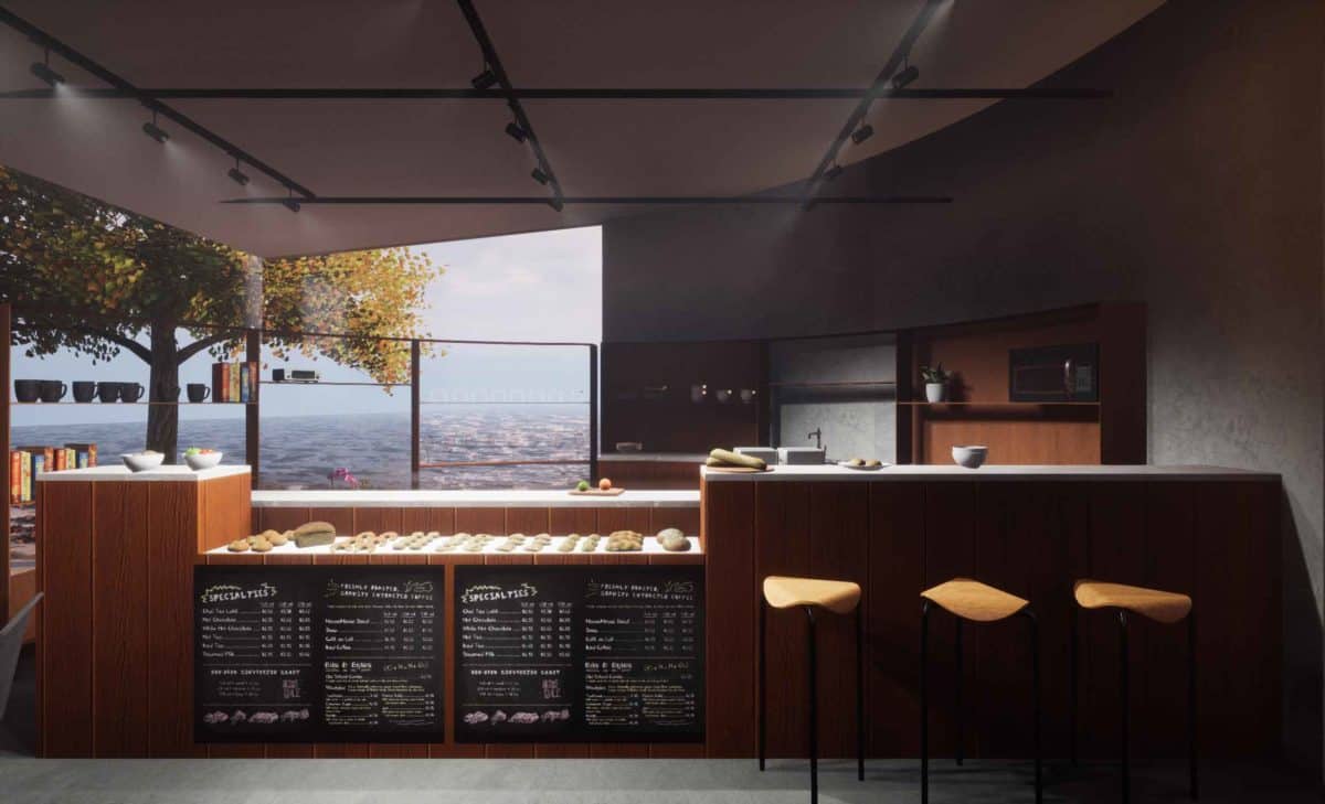
By living in Rhode Island, the designer was exposed to the deep coffee culture and endless miles of coastline that exists in this small state which ultimately influenced this design. This conceptual design was a fun challenge of architectural visualization and architectural design, all only within 2 days. Alongside this project, the designer made a 360 video of the space to further explore the spatial experience.
During wintersession of her freshmen year at RISD, she decided to take an interior architecture course to understand the difference between Interior Architecture and Architecture. During that class, she designed her first space. Five years later, Natasha revisited this project and redesigned it using the tools she had learned over the years at RISD.
The inspiration came from the way people would move around in this small space, which, eventually led to a conceptual plan of a comma sign within a square. From there, the plan began influencing everything from the furniture to program. The colors and materials were meant to gather a sense of cleanliness and simplicity, as it would be surrounded by nothing but trees and water.
Within each ArchViz project, there is something new to learn. In this design, Natasha learned how to control the lighting in her scene in order to create the exact mood she had in mind. She also learned how to take 360 videos of the space at a high resolution, making the space fun to explore even by phone. To see the video and other images, click the link below:
https://www.natasharuiz.com/comma-cafe
- Architect: Natasha Ruiz


