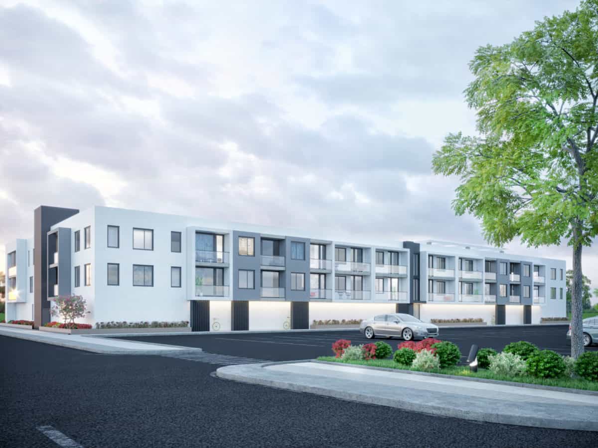
The complex is an apartment building with parking.
The building has three floors, it has one central entrance.
On the ground floor, from the front side, there are utility rooms
for the needs of the future residents of the building.
On the back of the building are balconies.
The layout is designed so that each apartment has a balcony.
The common roof terrace was also designed with elements of a green roof.
This project was implemented for marketing purposes.
The initial data for the project were the reference images of the client and the geolocation of the future project.
The project began with the creation of small volumes on the attached plot of land.
After the form of the building was accepted by the customer, we began planning the location of exits, windows, and balconies.
The materials were chosen in accordance with the client’s preferences.
The client wanted to see a white building, but at the same time it should not have become boring.
In this, we added highlights, gray and black colors.
Also having worked the elements of the landscape, we made the picture augmented.
First of all, we received a positive response from the client.
He was pleased that we were able to clearly show the idea that he described.
With this project, we have improved our work,helped the client with the visualization of his ideas,added one more beautiful work in our portfolio.
- 3d artist: Ruslana Buryakovska
- 3d artist: Igor Buryakovsky


Initially the design seems very simple. The rooftop terrace is a nice touch and great use of the space that usually goes untouched!