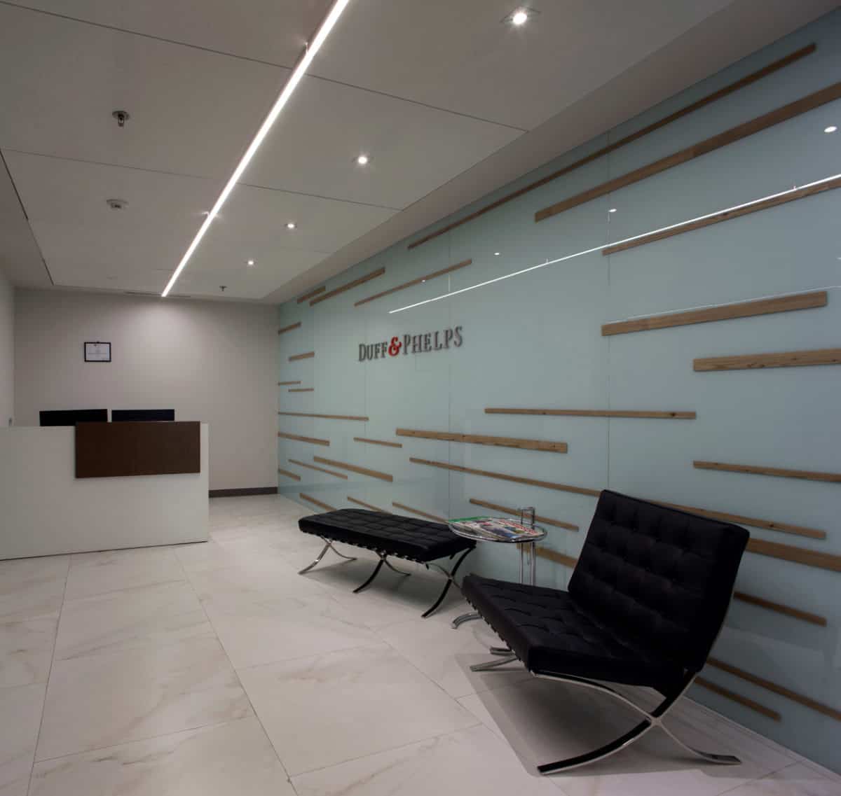
The company required a corporate project based on a global design outline. Therefore we located the principal areas towards the main façade —such as private offices and meeting rooms— to achieve the most efficient use of energy.
Based on the above for our project Work+ team visualized the new corporate offices for Duff&Phelps in an open space plan with a lighting system installed on the gypsum board plafond with an integral system that projects indirect light towards the work surfaces.
The dining room area was also located towards the façade so the users may enjoy natural light for the longest time to improve their productivity. Inside of this space we allocated a nursing/resting area with all the necessary specifications and equipment needed to give the best service to each person.
As in all of Work+ projects, the requirements marked by the users, were our main target and we cared to the last detail. The slab was covered with acoustic material for a more comfortable ambiance in all the areas and we achieved a perfect balance between well being, contemporanity and productivity.
The woods and carpets in neutral colors are enhanced by some accents of red furniture. The company´s productivity was the axis that showed the development of this project that resulted in a space with plenty of natural light, open and organized.
- Interior Designer: Work+
- Photographer: Pedro Hiriart


