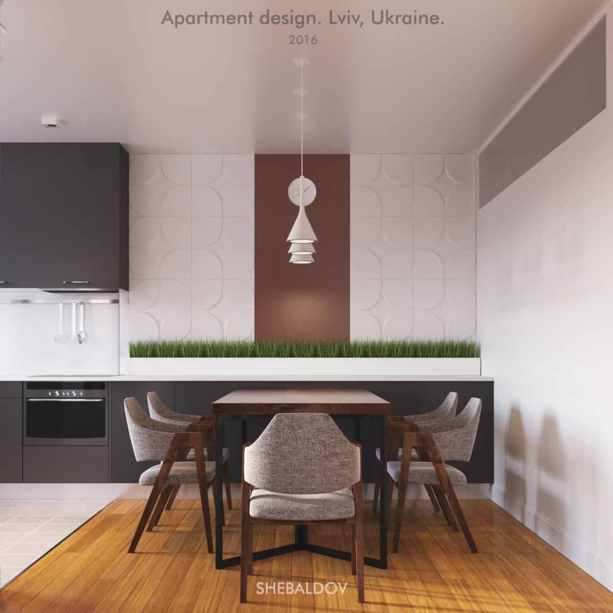
With minimalistic approach, with strictness of shapes, with minimum of decorative elements.
But still vital and fresh, with it’s each interiors individuality accordingly to the person, function, and predicted mood into which rooms should cast visitor at the entrance.
More space, more light, less furniture. Only what is needed.
It is paraphrased aim which i had to obtain in this project.
Hope you will feel it as well.
Project was developed for the independent young lad, who felt lack of space and taste in his hub.
Hence, the task was :
• Make minimalist interior design with no frills.
• Create spatial lightness on existed square.
• More light.
Due to the set task, style of apartments had been already predicted before first sketch was drawn.
It should be such as it is.
Color decisions were chosen accordingly to their specific influence. They should conduce to the appropriate mood: to the vivacity, to the relaxation, to the solitude.
Efforts were rewarded.
Customer confessed that is what he fancied, something what he sought to embody in his dwelling, but didn’t know what and how.
He wanted to refresh his place, reconstruct it. Make it different from what it was. Wanted to feel familiar space anew.
Help in this problem came with this project.
- Interior Designer: Andrei Shebaldov


