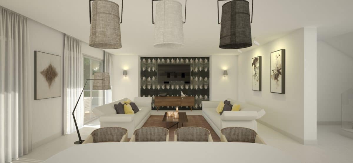
Loma de Casasola is a residential project consistent of 6 luxury villas in Guadalmina, Marbella. Villas were designed by Juan Antonio Fernandez prestigious Spanish architect. My part of the project was giving future clients a view of the interior design possibilities the villas offered. Modern and relaxed atmosphere and a beautiful design in a beautiful house.
I did this project as a part of my internship for Casas de Benahavis where I was working on their residential project Loma de Casasola. Gated residential area consistent of 6 luxury villas. The main goal of my design was to give the clients a beautiful relaxed rooms with a nice coherent setup and furniture list. I picked out furniture, and accessories. Chose the finishes of the walls. And created mood boards with a collection of everything I wanted along with a package of models, textures and more that I later sent over to a company called areadesign that finished off the renders.
The villa I was working on is a new built, very modern and elegant. What I went for in my design was a modern, stylish feel. A place where people could feel at home. I didnt want it to cluttered. I took my inspiration from all over and mainly looked around for inspiration wherever I could. The internet is a sea of information’s and ideas and a inspirational gift to designers everywhere. I visited stores in the area to have a look at the selection they carried of furniture’s and wallpapers mainly. I tried to balance the color scheme with my furniture choices the best way possible to get a warm and modern feel in this beautiful building.
I did learn a lot from this project. I learned that I like being bold and sometimes pushing people to make some quirky decisions. Like when I wanted to put this sofa into the bathroom I got mixed feelings but in the end I do like it in there and it gives the bathroom a different style and look to what you would normally see. The yellow bedroom I believe is a perfect mix of warm and cool and honestly it became my dream bedroom. Sometimes more is less and other-times less is more but you need to know when to go for more and when to go for less. I would just say, we should always try to use color and prints in our designs. For me I still need to keep a consistency in my design but each to their own. Design is supposed to be fun and beautiful at the same time and you have to keep in mind that you can never please everyone so make sure first and foremost that you are pleased and feel like you delivered what you set out to do.
- Interior Designer: Loma de Casasola
- 3d visualization: Areadesign


